

Axure Tutorial: Make Dropdown with Tree
Introduction
The dropdown is one of the most space-saving selection control. We can use the dropdown to quickly select options; if there are too many options, we will also use the dropdown tree to classify the options, such as Item 1-Item 1.1 , the classification can make it easier for users to find the corresponding options. So this tutorial mainly introduces how to make a high-fidelity dropdown template in Axure.
Features to be Realized
- Pop-up effect: After clicking the dropdown box, a tree popup will pop up, and it will be automatically closed when you click other content.
- Expand and Collapse: Click the tree node to switch to expand or collapse the corresponding child node.
- Selection echo: After selecting the content, echo the selection content to the drop-down box
Widgets Setup
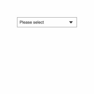
1. Dropdown box panel
The dropdown box panel consists of a rectangle and arrows.
Rectangle - the fill color is white, the border color is gray, and the default text is please select;
Arrow - Default down.
2. Tree dropdown list
Tree - this case uses the tree widget built in Axure. The advantage of using the tree widget is that it can be used directly without writing logic by itself. However, the disadvantages are also obvious. First, the tree nodes need to be increased one by one, which is troublesome and waste time; Second, you can't do search or multi-selection effect. If you want to display this effect, you need to use repeaters to make trees. Today we start with simple basic ordinary tree widget. In the future, if you are interested in search and multi-selection effect, I will continue to update the tutorial.
Dynamic panel - The function of the dynamic panel is to add scroll bars. We directly turn the tree into a dynamic panel, cancel the adaptive content of the dynamic panel, adjust it to a fixed size, and then set the vertical scroll bar to be displayed.
3. Interactions Setup
1. Dropdown box interaction
When the mouse clicks the dropdown box panel, the dropdown list panel is shown. Here we want light box effect.
The light box effect is that if the mouse clicks on the content other than the pop-up window, the pop-up window is automatically closed.

2. Dropdown list interaction
Rotate the arrow when the dropdown list is shown and hidden.

3. When the tree node is clicked
When the tree node is clicked, we do two interactions.
Set text: Set the default text of the dropdown box to the text of the currently clicked node. For convenience, we can use This.text directly. This action is to echo the text, and we can know whether and which option has been selected.
Hide: Hide the dropdown list, because this is a single-selection tree, so after selecting an option, the general logic is to automatically hide the pop-up window.

Then we need to copy and paste this mouse click interaction into each selectable tree node.
In this way, we have completed the entire widget, combined it, and then you can directly copy it or drag it from the widget library to use.
If you have any questions and suggestions, please leave a message.
If you like the article, please share it with others with page link, thanks for your supporting! ❤
Note: Click here to download the completed RP file for this tutorial (RP 10 or up).
Well Joe @AxureBoutique, a technology writer and teacher, focuses on Axure prototype design and product design.


Leave a comment