

Axure Tutorial: Dynamic Histogram
Introduction
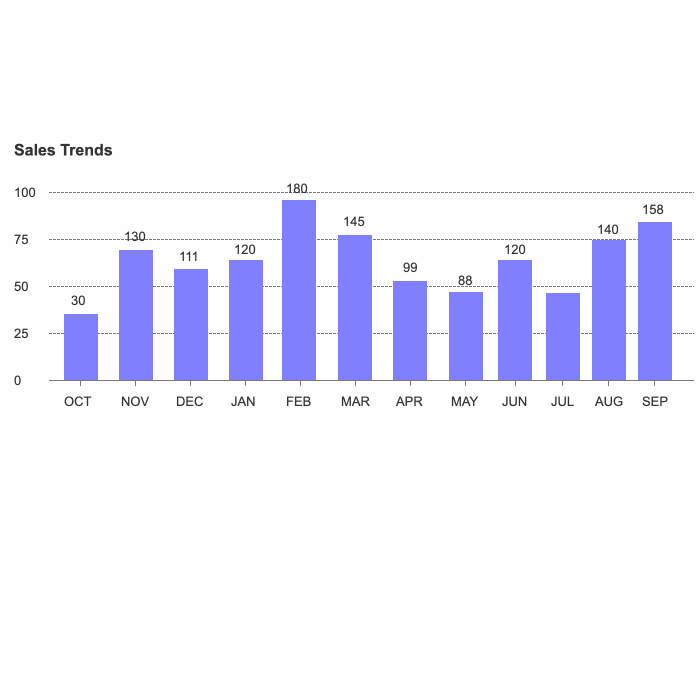
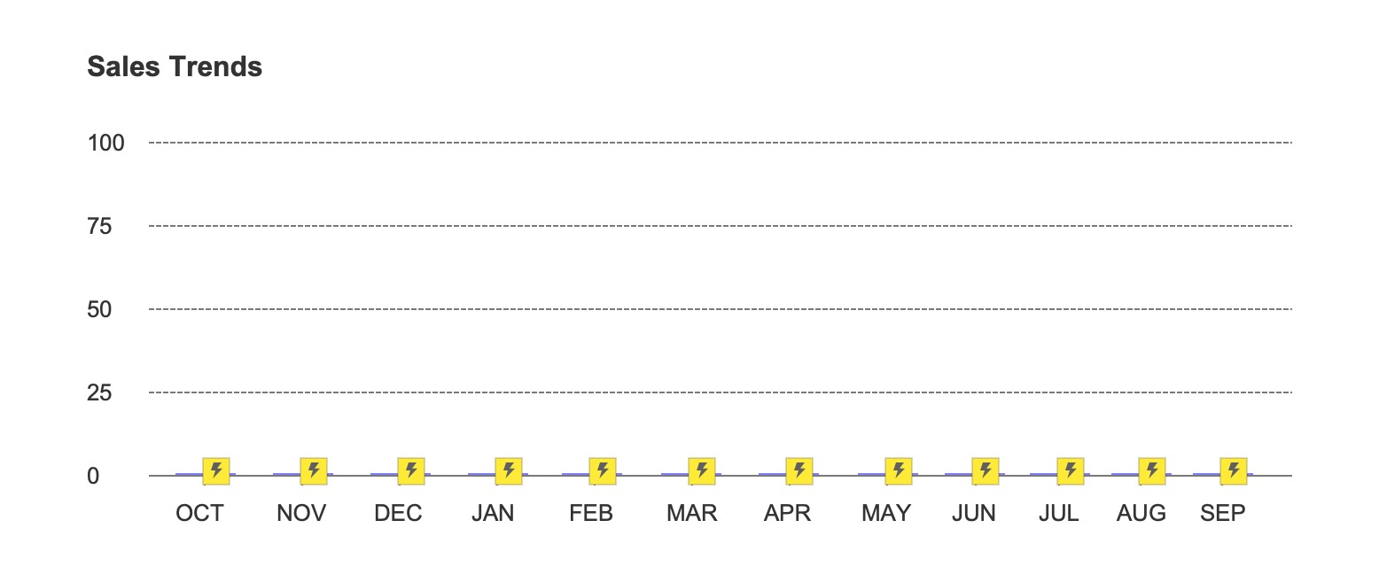
When we draw diagrams, we often need to design various statistical diagrams. A dynamic statistical diagram will be easier to add points when it is presented to customers or leaders. This article will first teach you how to draw dynamic histograms.
1. Dynamic histogram drawing tutorial
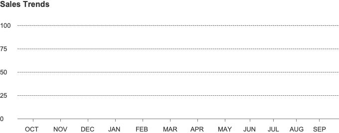
First, after we open Axure, draw the corresponding basic line and text description (the parameters in this article are for reference only, please draw the parameters according to actual needs).
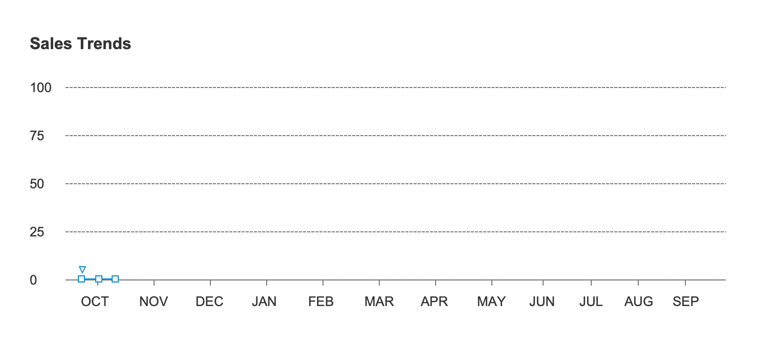
Select a rectangular, set the height to: 1, adjust the width and fill color according to the usage scene, here I place the rectangle in the center above the "OCT" to facilitate the display of dynamic effects later.
Then we set up the interaction effect.
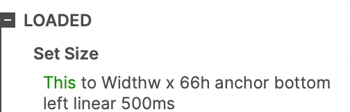
Select [When Loaded - Set Size - This], the height is set to: 66, the animation effect: linear 500 milliseconds.
Next, we copy the rectangles, copy them on different "months above", and adjust the size and height of the copied rectangles.
Finally, according to the aesthetic effect, we can set the display of the number of height above rectangle and set the interaction on the rectangle [Loaded-Show-numbers], so that our entire histogram is made.
In the next article, we will introduce in detail how to draw dynamic line charts
If you like the article, please share it with others with page link, thanks for your supporting! ❤
Note: Click here to download the completed RP file for this tutorial (RP 10 or up).
Well Joe @AxureBoutique, a technology writer and teacher, focuses on Axure prototype design and product design.


Leave a comment