

Axure Tutorial: Left Navigation Adapt to the Height of the Browser Window
Introduction
Adaptive browser window height means that when the browser width and height change, the controls matching the window size will be displayed. This time I share the method of using Axure to realize the left navigation adaptive browser window height. I hope it will be helpful to you.
Features to be Realized

When the browser height changes, the height of the left navigation changes with the browser.
How to Realize these Feature
Set the interaction event when the window resized. The height of the left navigation is equal to the height of the window.
Preview the completed prototype for this tutorial
Widgets Setup
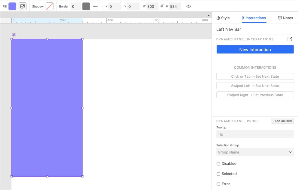
name the dynamic panel left Nav Bar.
2. Set the background color of the dynamic panel to the desired color.
3. Move the dynamic panel to the upper left corner of the canvas (0, 0).
Interactions Setup
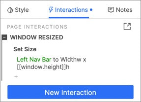
Set the height of the Left Nav Bar equal to the [[window.height]] when the window resized.
In this way, all the settings are completed. If you have any questions and suggestions, please leave a message.
If you like the article, please share it with others with page link, thanks for your supporting! ❤
Note: Click here to download the completed RP file for this tutorial (RP 10 or up).
Well Joe @AxureBoutique, a technical writer and teacher, focuses on Axure prototype design and product design.


Leave a comment