

Axure Tutorial: Common Widgets - Dynamic Panel
Introduction
This article is a part of course Axure Full Course: Tutorial, Tips and Templates.
Dynamic Panel is the most powerful interactive component of Axure RP. It can be used to quickly create various interactive effects: such as the switching of the carousel, the switching of different states of the card.
It can be said that if you master the use of the dynamic panel, you will master the essence of Axure.
Creation of Dynamic Panel
There are two ways to create a dynamic panel: one is to directly drag the Dynamic Panel Widget onto the canvas; the other is to select the widget(s) that you want to create a dynamic panel, then right-click and select Create Dynamic Panel. The second method is recommended.
 Right click widget(s )to create dynamic panel
Manage Dynamic Panel State
State Canvas and Size
A dynamic panel can add multiple states, each state has its canvas, and the canvas takes the upper left corner as the coordinates 0, 0.

Dynamic Panel State Canvas
If you want the size of the dynamic panel to fit the size of the widgets inside, you can check the Fit to Content option, if you want the dynamic panel to be fixed in size, you can uncheck it.

Set the size mode of Dynamic Panel
Add States
You can add multiple states to the dynamic panel. After entering the dynamic panel canvas, click the Add State button to add a blank state or hover over the state and click the copy state button to add or copy a new state.

Change State Display
Dynamic panels can only display one state at a time.
To change the display of the state, you can do so by adding interactive events. For example, when a button is clicked, jump to another state.

State: You can choose a specific state or jump to the previous or next, you can choose whether to Wrap from last to first.
Animation: you can set the animation when jumping.
Repeat: If Next or Previous is selected, you can set whether to repeat and when to repeat.
Special Behavior: You can set whether to push the element to the right or down when the state changes.
Push/Pull Distance: You can set custom push distance or distance of new state size
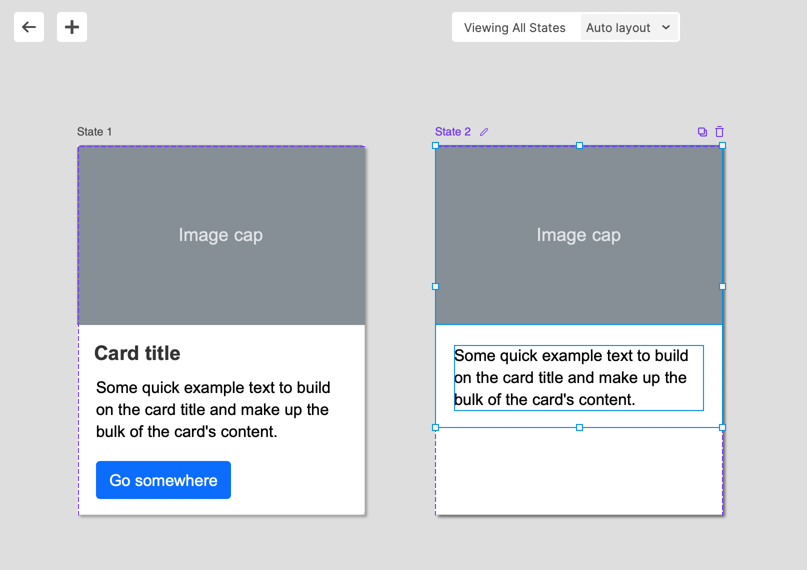
View All States Mode
If you want to view the content of all states at once when editing the dynamic panel state, you can click the View All button in the upper right corner.
In View All State mode, you can choose the layout of all states.
Click the back button in the upper left corner to return to the default mode, click the + button to add a new state.
Dynamic Panel Events
Dynamic panel have its own unique events:
Gesture:
Swiped Left: When the dynamic panel is swiped from right to left.
Swiped Right: When the dynamic panel is swiped from left to right.
Swiped Up: When the dynamic panel is swiped from bottom to top.
Swiped Down: When the dynamic panel is swiped from bottom to top.
Dynamic Panel:
Panel State Changed: When the dynamic panel's state is changed with the Set Panel State action.
Drag Started: When you begin to drag the dynamic panel.
Drag Dropped: When you stop dragging the dynamic panel (fires when the mouse button is released, not when it stops moving).
Dragged: Fires continuously while the dynamic panel is being dragged.
Scrolled Up: When the dynamic panel is scrolled up.
Scrolled Down: When the dynamic panel is scrolled down.
Scrolled: When the dynamic panel is scrolled in any direction.
Style Effects
If you want to trigger the Style Effects of the elements inside the dynamic panel when the mouse over it, you can check the Apply Mouse Style Effects on All Widgets in Panel.

Pin to Browser
Dynamic panels are the only widgets that can be pinned to the screen. Right-click on the dynamic panel, select the Pin to Browser option, and set the position of the dynamic panel on the popup window.
In this way, when you scroll the window, the dynamic panel is fixed to the corresponding position of the screen.

Dynamic Panel Content Scrolling
If you uncheck the Fit to Content option and choose to scroll the content of the dynamic panel, if the size of the content in the dynamic panel is smaller than the size of the dynamic panel, you can scroll the content in the dynamic panel.
This is useful for making scrollable fixed size widgets.

That's all for today's lesson.In the following lessons we will continue to introduce commonly used widgets.
If you have any questions and suggestions, please leave a message.
If you like the article, please share it with others with page link, thanks for your supporting! ❤
Well Joe @AxureBoutique, a technology writer and teacher, focuses on Axure prototype design and product design.


Leave a comment