Axure Tips: How to Design Tab Bar Quickly and Effectively
Introduction
Summarize two criteria for a good Axure prototype: low maintenance cost and high reusability. The low maintenance cost means that it is easy to modify, which requires the simplest method to achieve a certain effect. For example, for a feature that can be realized with its own function, there is no need to write code for secondary development. High reusability is actually a dimension for coders to evaluate code quality. The advantage of modularizing and mastering the prototype is to improve efficiency and avoid repeated wheel making.
This paper takes the common Tab Bar in prototype design as an example:
Negative Example 1
The core of this method is to use interaction events, "select" and "unselected" events.
1. Set the interaction style of the selected tab

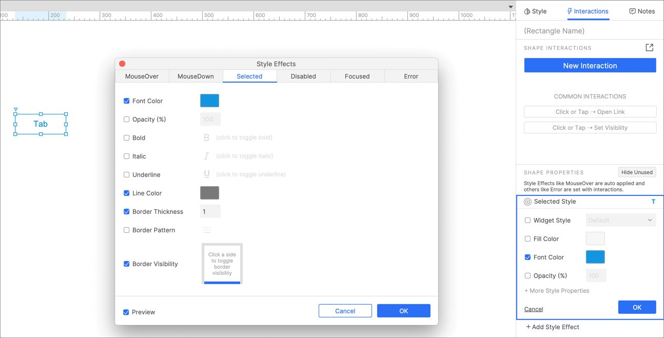
Click the "selected" button under the interactive style setting in the widget properties to set the effect of the selected state of the widget, which uses four attributes: Font Color, Line Color, Border Thickness and Border Visibility. In addition to the selected effect, you can also set other effects, such as mouse over, mouse down and disabled.
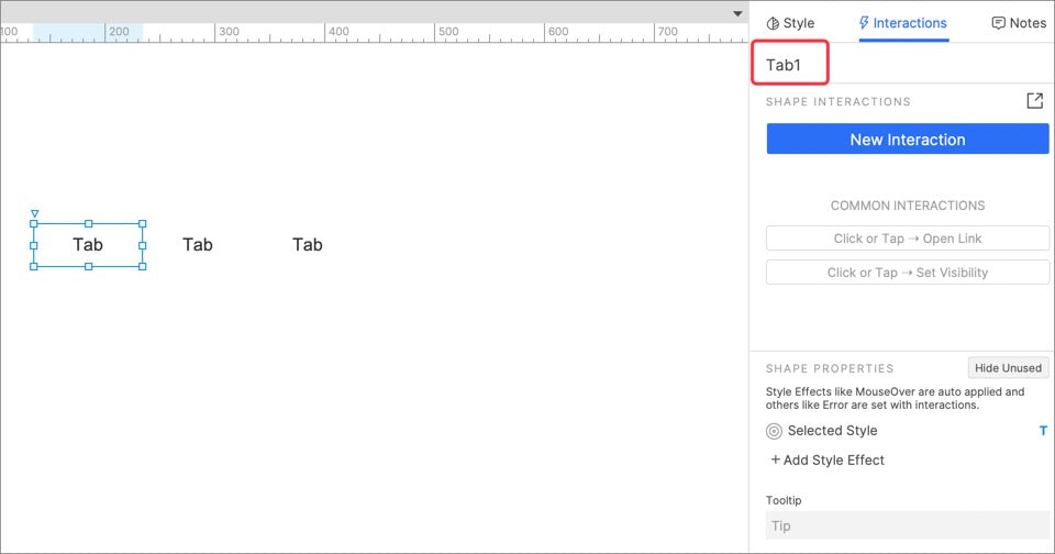
2. Copy multiple tab buttons and name them

3. Set interaction events for each tabs

When clicked, the selected state of the current widget is "true" and all other widgets are "false". The interaction events of each tab are different. It should be noted that the more tabs in this method, the higher the possibility of error.
4. Completion effect

Negative Example 2
Using dynamic panel is actually an enumeration method. Each tab state corresponds to a dynamic panel state. Although the tab effect can also be achieved, the use of dynamic panels here is overqualified.
1. Set the style of each selected state

First enumerate the tabs of all States, that is, draw the tabs of all States by copying.
2. Set the dynamic panel for each state

Set dynamic panel states for all tabs, and then put the tabs into the dynamic panel.
3. Set interaction events for each state

In this step, set the interaction event of each tab, and click tab to show the corresponding dynamic panel state.
Correct Example
The core of this method is the use of selection group. Many people may not have used the selection group method. The selection group actually exists to realize the feature similar to tab. Only one widget in the same selection group can have a selection state. This feature is like a built-in function in Excel, although it can also be realized through basic arithmetic operations. Through the built-in function, you can reduce a lot of time costs for users, reduce the possibility of errors, and make you more professional.
1. Set the interaction style & interaction event of the selected state of tab

Here, you only need to set a tab and then copy it as other tabs. The interaction style here is the same as the first step of negative example 1. At the same time, set the interaction event. When clicking the tab, the selected state is "true".

As for the effect of the horizontal line under the selected text, many people will use the combination of horizontal line and rectangle to realize it, which is actually an extremely unprofessional practice. The simplest way is to set the visibility of the border in the interaction style settings. You can set the showing and hiding of the rectangular border at will.
2. Set the selection group name for Tab

3. Copy to multiple tabs

In this way, all the settings are completed. If you have any questions and suggestions, please leave a message.
If you like the article, please share it with others with page link, thanks for your supporting! ❤
Note: Click here to download the completed RP file for this tutorial (RP 10 or up).
Well Joe @AxureBoutique, a technical writer and teacher, focuses on Axure prototype design and product design.


Leave a comment