

UI/UX Design: Grid System
Introduction
The best way to achieve good page layout is to apply a grid system. The grid is the skeleton of the design, through which we can make guided design decisions and create a better experience for our users.
The history of grids
When it comes to the use of grids, we go back a long way. The figures depicted by the ancient Egyptians in their carvings and paintings followed a rule that set the scale as a human fist, with a standing figure measuring 18 fists from the ground to the top of the head.

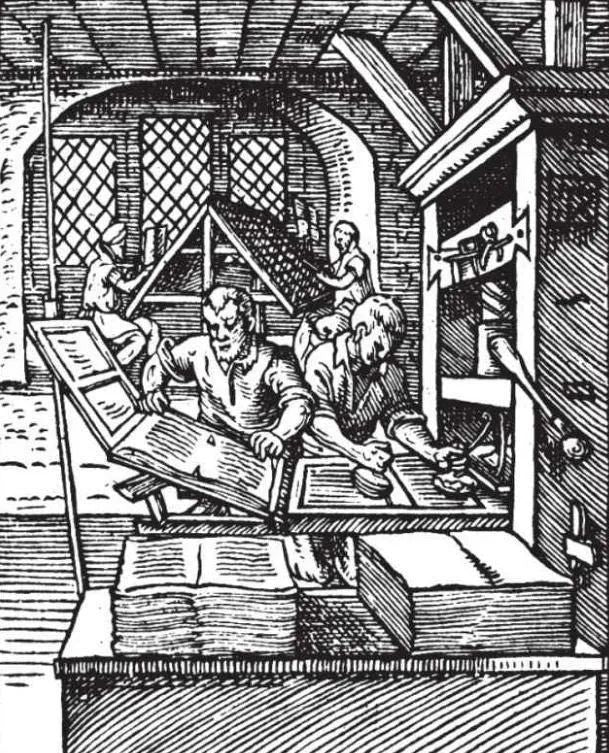
In the West, metal movable type printing appeared around 1450, and the publication of the Gutenberg Bible around 1455 would be the first major milestone in publishing. Metal type text makes better use of the grid.
By 1917, the grid was most evident in the Dutch De Stijl movement, led by artists Theo van Doesburg and Piet Mondrian. They restrict the canvas to intersecting vertical and horizontal lines and primary colors.

In 1919, the Bauhaus school in Germany was established, and their simple and practical design concept also used the concept of grid. Like the famous Bauhaus chess, its pieces are simple geometric shapes such as squares and rectangles that can be tightly grouped together for compact storage.

In the 1950s, a new style of graphic design finally took shape in Switzerland. This style of design strives to achieve unity in design through a simple network structure and a nearly standardized typography. This style continues to influence many web and graphic designers to this day.

With the end of World War II, a new kind of consumerism emerged. With the rapid economic development, the prosperity of the advertising industry is gradually rising. Paul Rand, as the first commercial artist in the United States to apply the Swiss graphic design style, is known for his corporate brand logo design and commercial advertising design, and the grid has played an important role in this new form of advertising.
Today we are going to talk about grid systems for web design. It sounds simple, but it actually contains a lot of complex concepts. The first step in web design is how to layout. Where are the headers, navigation, and buttons? What is the spacing between each element? These are inseparable from the page layout. As the foundation of web design, page layout can greatly affect the fluency and intuitiveness of user reading. Before talking about page layout, we need to popularize some concepts first.

2. Page layout
A page layout is the arrangement of all the visual elements on a web page. Through the orderly arrangement of page elements, the relationship between elements can be established to better guide the user experience. As a key component of web design, layout determines which elements of the page receive the most attention, as well as the overall visual balance of the page. In conclusion, a good page layout can direct the user's attention in the right direction. Attract them to the most important elements first, then read the rest in order of importance.
3. Role and concept of grid
The best way to achieve good page layout is to apply a grid system. A grid is the skeleton of a design that helps us align and organize page content in an orderly manner. Through the correct use of grids, we will not arbitrarily place elements on the page, but clearly know where to put these elements in a reasonable position, which helps to improve design efficiency and design quality. Whether designing for PC or mobile, using grids will guide us to make design decisions and create a better experience for users.
The grid consists of several parts: column, gutter and margin. Together they form the horizontal width of the screen.
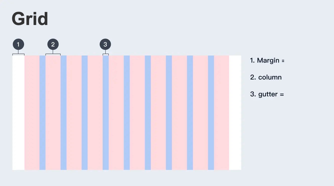
Column style=”font-size: 16px;”> is the vertical section that spans the content area. The more columns you have in your web design, the more flexible the grid will be. The width of the columns is determined by the designer. The traditional practice is to use 12 columns on the PC-side web pages, 8 on the Pads, and 4 on the mobile devices. Column width is generally defined as 60~80px. Column width is a key factor that affects the actual content width.

Gutters are gaps between columns. The role of the gutters are to divide the content of each module vertically. Wider gutters are more suitable for larger screen devices. The wider gutters can be used to increase the spacing of the pages, so that the page information can be displayed more stretched.

Margin is the space between the content and the left and right edges of the screen. Wider margins are better for larger screens because they create more white space around the content.

Having introduced the above 3 concepts, we can use the 8pt grid system to segment the page. 8pt grid system that uses increments of 8 to adjust the size and spacing of page elements. That is, the height or width, margins or padding in the page are all multiples of 8.
4. 8pt grid introduction
Have you ever wondered why we choose a very small drawing board when we design the mobile interface, but our display device is very large?
For example, we use the size of 375×812 to design the iPhone X, but the actual size of the iPhone X is 1125×2436, which is 3 times the size of our design.
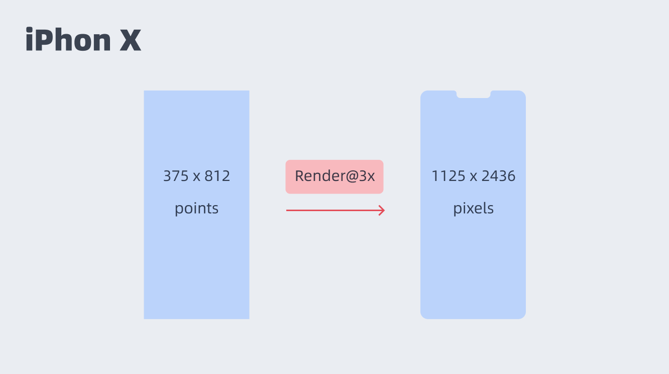

Because the design size will be rendered in 2x or 3x pixels. For example, iphonex will be rendered in 3x size, and iphone8 or iphonexr will be rendered in 2x size. Therefore, we can use 1 time of the minimum size for design to adapt to different sizes of different equipment. Therefore, 1pt can be converted to 1px, 4PX, or 9px of @ 1x (one size), @ 2x (two times), and @ 3x (three times), respectively.

So we design a 16pt icon, and the size of the exported @2x or @3x should be 32px, 48px.
5. Why must 8pt be used?
Using even numbers to adjust element size or spacing between elements works well on screens of all sizes. For example, under the @1.5x size, if you use an odd number to define the element size or spacing, it is easy to have half a pixel. If 5px is exported to 1.5 times the size of 1x, it is easy to have half-pixel pixels. The reason for choosing 8 is also because most screen sizes are divisible by 8, which makes it easy to adapt. In addition, 2 or 4 are not used on the PC side because the granularity is too small, which is inconvenient for designers to operate; another advantage of using a multiple of 8 is to avoid us being too entangled in the design.
6. How to set text?
8pt grid based typography system. Font sizes can be designed in different sizes, but their line heights should be a multiple of 8
For example:
small = 8px
medium = 16px
large = 24px
x-large = 32px
……
Page layout type
After popularizing the above concepts, let's further understand the layout of the page. The page layout is roughly divided into several categories: fixed layout, fluid layout, adaptive layout, and responsive layout.
Fixed layout, as the name implies, is that the overall width of the page is fixed and will not change as the browser stretches. This kind of page is relatively rigid and single, but it is relatively easy for designers to design and develop.

A fluid layout, which changes with the size of the browser window, but the logic of its change is defined as a percentage of modules. A fluid layout fills the width of the page no matter what the width of the browser is. Second, fluid layouts do not require as diverse changes as responsive layouts. It has some drawbacks on very large or very small page widths. For example, if the page is very wide, the content may be stretched too long, and a single paragraph of text may run across the page on a single line. Conversely, multi-column layouts on small screens can also be too crowded for content.

Adaptive layout can be understood as an upgraded version of fixed layout. For example, when the page content is 960px, no matter how wide the page is stretched, the page content will always display 960 width. If the width is reduced to a critical value, such as within 960px, the page will be reduced to its second width, assuming 640, and so on. This critical value is called breakpoint.

Responsive layouts combine fluid and adaptive layouts. Responsive layouts will change like fluid layouts as the browser width increases or decreases. At the same time, if the browser width exceeds a certain critical point, the breakpoint, the page layout will also change. Generally, responsive layouts are designed to be compatible with different devices such as web, tablet and mobile, which will bring users a better browsing experience.

Finally, a legend is used to show how to use the grid system for page layout in web design.


We can set the number of columns, define the column width and gutter width to determine the actual width of the page.
The shallow value of using grid system in web design is to make the page layout follow the rules and make the page look more unified. The deep value is actually to make adaptive layout and make the page adapt to different devices under different widths.
Here I have also created 4 different sizes of web-side grid systems for your reference. You can also build your own grid according to your actual situation.

Remember, in the actual project, use the grid as flexibly as possible, don't stick to 8pt units, but try to keep it in an even range.
If you like the article, please share it with others with page link, thanks for your supporting! ❤
References
https://medium.com/swlh/the-comprehensive-8pt-grid-guide-aa16ff402179
The Comprehensive 8pt Grid Guide
https://uxplanet.org/ui-ux-design-setting-up-grids-d8b3fd9271fb
UI/UX Design: Setting Up Grids
https://material.io/design
material design
https://webflow.com/blog/history-of-grids
History of grids: from the printing press to modern web design
https://99designs.hk/blog/tips/history-of-the-grid-part-2/
History of the design grid


Really strange
I am sorry, that I interrupt you, but it is necessary for me little bit more information.
Leave a comment