

Relieve User Anxiety of Waiting - Progress Indicator
Introduction
In the process of using application software, users may experience waiting scenarios. At this time, at the level of interaction design, how to alleviate users' waiting anxiety, reduce user churn, and ensure users' product experience? Maybe you can use progress indicators to ease the user's waiting anxiety.
1. Why do we need progress indicators?
People's patience with waiting is limited. When an operation needs to wait for a long time, users will feel anxious, and it is easier to give up the operation or even the whole product. Therefore, it is very necessary for the system to feed back the current progress to users at an appropriate time.
According to research by Jakob Nielsen:
-
0.1 second
is about the limit for having the user feel that the system is reacting instantaneously, meaning that no special feedback is necessary except to display the result.
-
1.0 second
is about the limit for the user's flow of thought to stay uninterrupted, even though the user will notice the delay. Normally, no special feedback is necessary during delays of more than 0.1 but less than 1.0 second, but the user does lose the feeling of operating directly on the data.
-
10 seconds
is about the limit for keeping the user's attention focused on the dialogue. For longer delays, users will want to perform other tasks while waiting for the computer to finish, so they should be given feedback indicating when the computer expects to be done. Feedback during the delay is especially important if the response time is likely to be highly variable, since users will then not know what to expect.
Due to the large amount of data or network reasons, it is inevitable that there will be a long waiting time. The following are common examples:
- Operations on large files. Such as opening large files, copying large files, deleting large files, etc.
- Software startup process. Such as some large games, Adobe software and so on.
- Operations requiring networking. Such as uploading, downloading, playing, etc.
- Search. Whether connected or not, as long as the amount of data is too large, there may be a long waiting time.
- Install software.
Therefore, how to solve the problem of user anxiety through progress indication is what user experience designer needs to consider.
2. Form of progress indication
When it comes to progress indicators, your first reaction may be a bar-shaped progress bar. In fact, in addition to bar-shaped progress bars, there are many forms of progress indicators.
1. Progress bar
This is a form that most people can think of. If it is subdivided, it can also be divided into bar progress bar, circular progress bar, step progress bar, water wave progress bar (such as mobile phone charging effect) and so on. Progress bars are often used with percentages.

2. Loading
Loop loading animation, the most common style is chrysanthemum. Loop loading animation can let users know that the program is still running, rather than mistakenly thinking that the page is stuck or crashed. Used for the in-progress loading status. However, during the loading process, usually, the user cannot further operate and needs to wait until the loading is completed, so it is more suitable for the case that the user does not need to continue the operation during the loading process.

3. Skeleton Screen
Before the page data is loaded, at the position where the content will be loaded, first show the general structure of the page to the user with the placeholder graph, and then display the specific data content after the required data is loaded.

4. Step
Divide a process into specific steps and guide users to complete tasks according to the process.
3. Application scenarios of progress indicator
There are so many methods of progress indicator, how should we use it in specific scenarios, and what problems should we pay attention to?1. Open large files
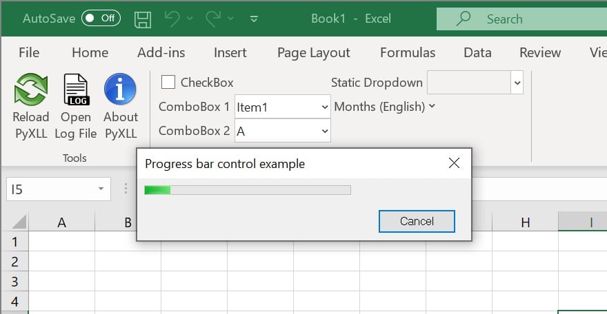
Sometimes when the file is too large, it will take a long time to open. At this time, a bar-shaped progress bar can be used to display the current status.
2. Copy files, delete files
3. Startup screen
The startup time of some software will be very long. A more positive approach is to display software-related images to users in the startup screen according to the characteristics of the software.
For example, Adobe Illustrator will display images carefully designed by illustrators when starting, which not only alleviates users' anxiety when waiting for loading, but also improves users' impression of software features. Some game software also makes good examples in the startup screen, such as increasing the sense of fun through relevant animations in the game at startup (provided that the loading time is not sacrificed), or providing some tips in the game.
A negative example is the startup screen of many mobile apps. The screen is full of advertisements, which greatly affects the user experience. For some older people, it is easy to accidentally click on websites that they do not need at all.

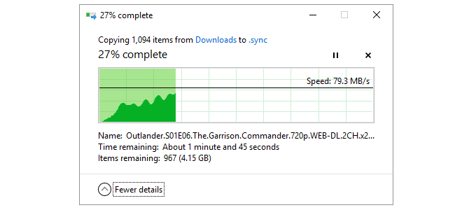
4. Upload and download
Bar progress bar + estimated time
If you often use cloud storage, you will find that when uploading and downloading operations on the cloud storage, you often encounter the situation that the waiting time is too long due to poor network or too large files. Therefore, the cloud storage generally displays the time remaining and file size in real time.

5. Rendering list
When the internet connection is slow or there is a lot of graphic and text data, the skeleton screen can be used to render the list, which has better visual effect than Loading, and a little animation effect can also be used appropriately to relieve the user's anxiety.
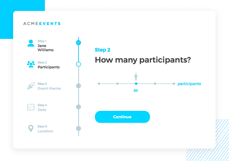
 6. Fill out the form
Step bar
If there is a lot of information needed for the registration operation, the information can be classified. Each category is a step, and the user will complete the entire operation in sequence. The step bar should generally not be less than 2 steps.4. Other tips for relieving users' waiting anxiety
- Operation can be carried out in the background;
- Can be controlled, such as can be paused, can be canceled.
If you like the article, please share it with others with page link, thanks for your supporting! ❤


Leave a comment