

4 Principles of UI/UX Design, Create a Sense of Sophistication.
Introduction
What makes a good UI/UX design easy to read? What makes it easy for users to browse? How do designers create a UI/UX that shines? The user interface is a critical part of any software product.
Good UI/UX design makes users even ignore its existence.
If it is not done well, it will become a stumbling block for users to use the product.
Most designers follow interface design principles in order to efficiently design UIs that satisfy users.
In this article, I will take you to understand the four principles of UI/UX design!
1. Aesthetics
In order to create a visual aesthetic UI, there are usually the following small rules:
1. Rule 1: Light comes from the sky
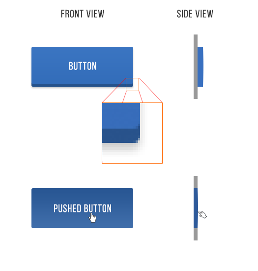
Shadows are valuable clues to what user interface elements we are looking at.
When light falls from the sky, it illuminates the tops of things and casts shadows below them.
Things are lighter at the top and darker at the bottom. The same goes for UI.
Just like all our facial features have small shadows on all undersides, almost every UI element has shadows on the undersides.
Our screen is flat, but the detailed design will make almost everything on the screen look three-dimensional.
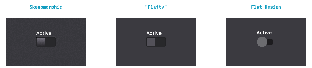
2. Rule 2: Black and white first
Designing in grayscale before adding color simplifies the most complex elements of visual design, allowing designers to focus on spacing and layout.
First, design black and white. Start with the more difficult problem, make the application beautiful and usable in all aspects, but do not need the help of color, and finally add color.
This is a reliable and simple way to make your application look "clean" and "simple". Having too many colors in too many places is often easy to screw up the design.
After that, adding a color to the grayscale application can simply and effectively attract the eye.
By modifying the saturation and brightness of a single color, you can generate multiple colors - dark, light, background, accent, eye-catching colors, but it won't dazzle people.
Using multiple variants of one or two basic colors is a reliable way to highlight or neutralize elements without confusing the design.
3. Rule 3: Double the white space
To make the UI look more comfortable, you need to add a lot of breathing space.
White space is one of the most overlooked and underutilized elements of a great visual layout.
Many times, white space is seen as empty space, and therefore wastes screen space.
Whitespace is necessary to make a better and simplified layout, because it ultimately allows users to focus on what they intended to see. A lot of white space can make some messy interfaces look simple and attractive.
4. Rule 4: Create a focal point for each screen
Emphasis is a tactic of trying to draw the viewer's attention to a specific design element. This could be a content area, an image, a link or a button, etc.
We see the creation of focal points in most design fields, including architecture, landscape design and fashion design.

2. Clear
In order to convey information to users through visual elements and to navigate accurately without letting users lose their way, there are usually the following rules:
1. Rule 1: Avoid unnecessary complexity
Always aim for as few steps and screens as possible.
Use overlays such as bottom sheets and modal windows to compress data and reduce your application's size. At the same time, ensure that information is organized in an autonomous and independent manner. Tasks and subtasks can be grouped together.
It's important not to hide subtasks on pages that users don't expect. Organize screens and content according to clear and logical categories.
Also, always reduce the number of steps required to complete a task to a minimum.
When only one or two actions are needed, don't let users experience cumbersome clicks. The three click rule is one of the most practical UX design principles. It points out that users should be able to achieve any action or access any information they need by clicking no more than three times anywhere in the application.
Most importantly, never ask the user to re-enter information they have already provided. This could lead users to throw away their devices and simply give up on using them.
2. Rule 2: Provide Clear Signage
This principle involves an intuitive layout and clear labelling of information. Navigating through the app shouldn't be confusing in any way, even for first-time users.
On the contrary, the exploration of the interface should be interesting and comfortable to learn to use the application unknowingly.
Users should never doubt where they are in the software, nor should they constantly think about how to get where they want to be.
3. Rule 3: Promote visual clarity
Good visual organization improves usability and legibility, enabling users quickly find the information they are looking for and use the interface more efficiently.
When designing your layout, avoid having too much information on the screen at one time. Build grid system to avoid visual clutter.
Apply general principles of content organization, such as grouping similar items together, numbering items, and using headings and hint text.
3. Metaphors
Simplify visual cognition so that users can "understand" the interface as soon as possible. The graphic elements are in line with the user's association with the real world, and more in line with the user's inertial cognition of the interface.
Using metaphors in UI design allows users to make connections between the real world and digital experiences.
A good metaphor will have a strong connection with the past experience of the real world in the user's mind. Metaphor is often used to make unfamiliar things familiar.
Take the recycle bin on the desktop, for example, it contains deleted files - but it's not really a trash can, it's visually represented in a way that helps users understand concepts more easily.
When choosing a metaphor for your UI, choose the one that allows the user to grasp the finest details of the conceptual model.
For example, when asking for credit card details for payment processing, a real-world physical card can be referenced as an example.


4. User Control
Visual design should make the user feel that the user is controlling the interface, rather than being controlled by the interface.
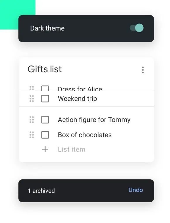
1. Rule 1: Make actions reversible
Users should always be able to quickly trace back to whatever they are doing. This allows users to explore products without fear of failure, and encourages exploration of unfamiliar options when users know that errors can be easily undone.
Conversely, if users have to be very careful with every action they take, it can lead to slow and unsettling exploration.
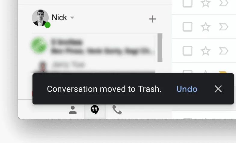
"Undo" can be very useful when the user chooses a system feature by mistake. In this case, the undo feature acts as an "emergency exit", allowing the user to leave an unwanted state.
For example, Gmail's notification message has an undo option, which is useful when users accidentally delete e-mail.
2. Rule 2: Adapt to different levels of users
Users of different skill levels should be able to interact with products at different levels. Don't sacrifice expert users for an easy-to-use interface for novice or casual users.
Instead, try to design for the needs of different users, so it doesn't matter if the user is an expert or a novice.
Once users are familiar with the product, users look for shortcuts to speed up commonly used actions.
Designers should make shortcuts available to experienced users, thus giving them a fast path.
If you like the article, please share it with others with page link, thanks for your supporting! ❤


Leave a comment