

APP Navigation Bar Design Analysis
Introduction
The APP navigation bar (AppBar) should be familiar to everyone. It is located at the top of the screen and integrates some features that users often use. It is an indispensable part of page design.
Although the navigation bar is very common, in the process of using the product, we will find that the navigation bar of each APP has some design differences more or less.
In order to let everyone have a clearer and more comprehensive understanding of the navigation bar, this article analyzes the design style, design style, interaction state and other aspects of the navigation bar together for analysis, let's take a look.
1. Composition of navigation bar
The whole navigation bar is usually divided into three parts: left, middle and right. The left and right are mainly used to place feature controls, and the middle part is mainly used to place titles. Next, let's analyze the composition of the three parts of left, middle and right.

1. Left part
Many of the controls placed on the left side of the navigation bar at the top of the app are related to actions, such as performing return actions, closing actions, or clicking Hamburg menu to expand actions.

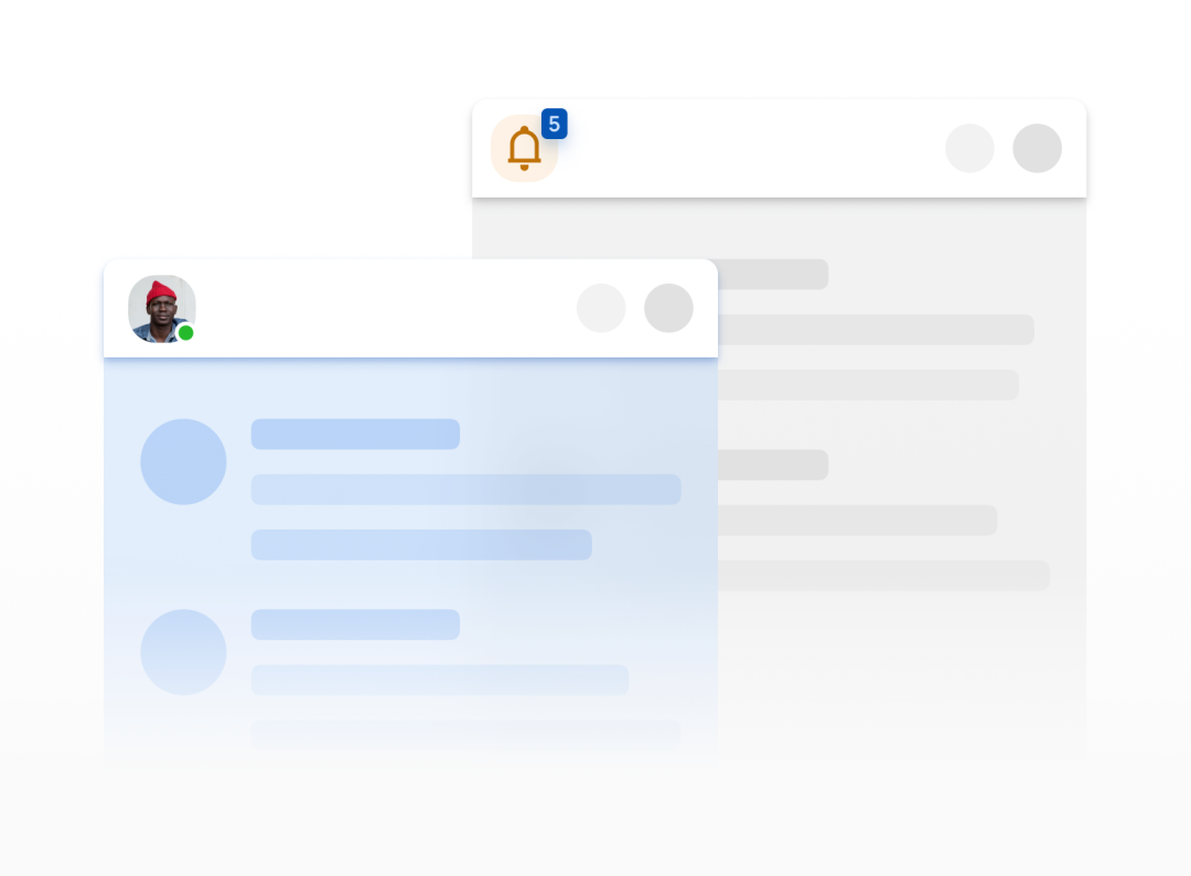
In addition to placing controls representing actions on the left, you can also place higher-priority content such as avatar and notification to attract users' attention.
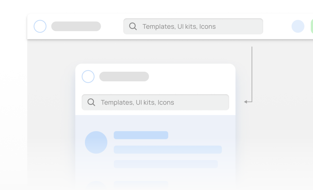
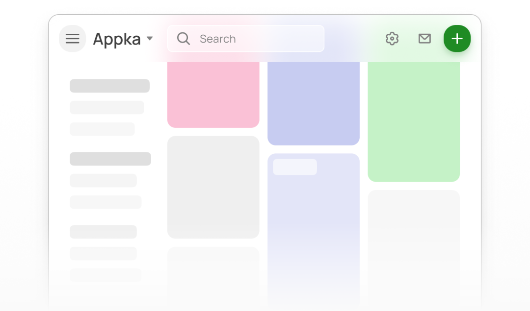
In the top navigation bar of the web page, the brand logo will be placed on the left side. Because the space at the top of the web page is larger, you can also combine the logo, search box, drop-down menu and other spaces around the logo.

2. Middle part
The middle part of the navigation bar at the top of the APP is mainly used to place the title. Of course, according to different use scenarios, you can also place avatars, search boxes, drop-down boxes, navigation and other controls.
(1) Title
The most common is to use bold text as the title in the middle, or you can use the form of main title + subtitle to display more information.

You can also make the title area into a type that supports drop-down to expand more features.
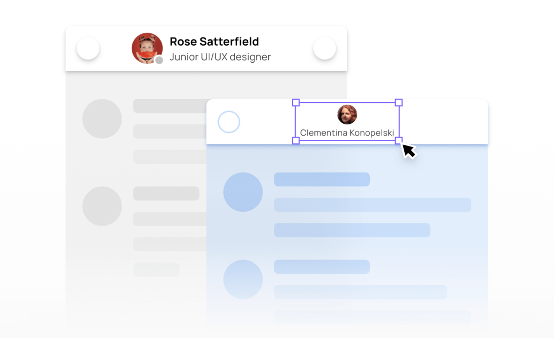
(2) User avatar
In social APP or dialog boxes, the user's avatar and information will be placed in the middle part to display the user's detailed information.
(3) Product Logo
Some products will also place the logo in the center of the navigation bar to display the brand image. This design can be considered on the homepage of the APP to play an emphasis role.
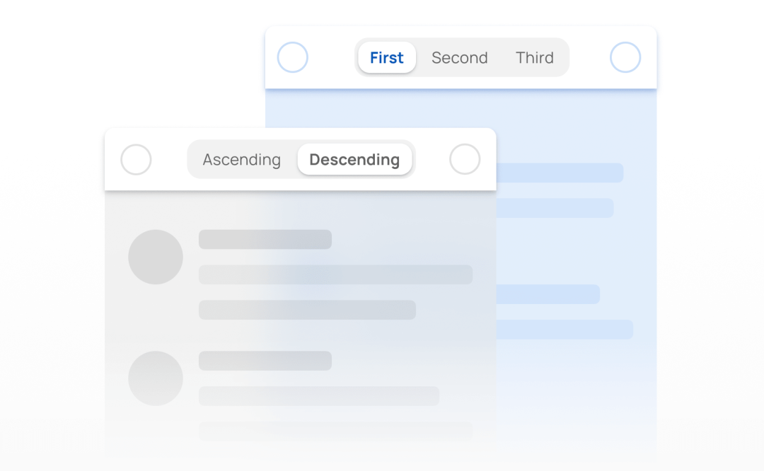
(4) Segmented controls
In mobile products, segmented controls can also be placed in the middle part, usually 2-3 tabs.
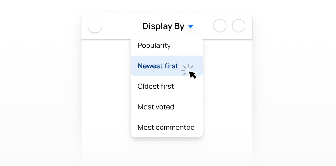
(5) Search box
The search box is often seen in the middle of the navigation bar, and then other controls are placed on the left and right sides of the search box. When there is too much content in the navigation bar, such as titles, avatars, buttons, etc., and the search bar and these controls may not be placed side by side, the search bar can be elongated horizontally and displayed separately on the next row.
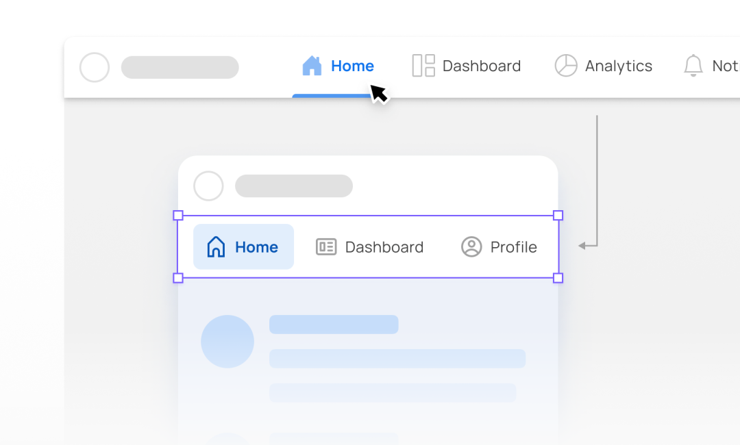
(6) Navigation options
In web, common navigation components such as tabs, buttons, and breadcrumbs are usually fixed in the center of page. When the page is scaled down to the mobile size, considering the small size of the mobile terminal, if the top navigation content is too much, you can try to put the components on the second row.
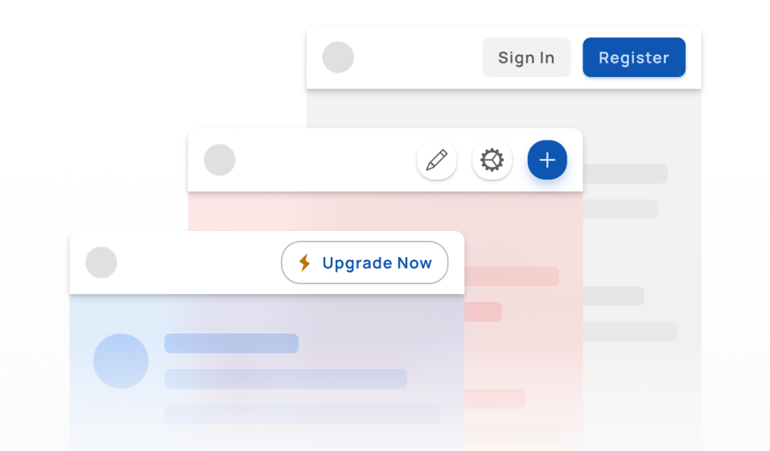
3. Right navigation
Compared with the left and middle, the right part of the APP navigation bar is more flexible. There are no fixed requirements for what content must be placed, and various types of controls are placed according to requirements.
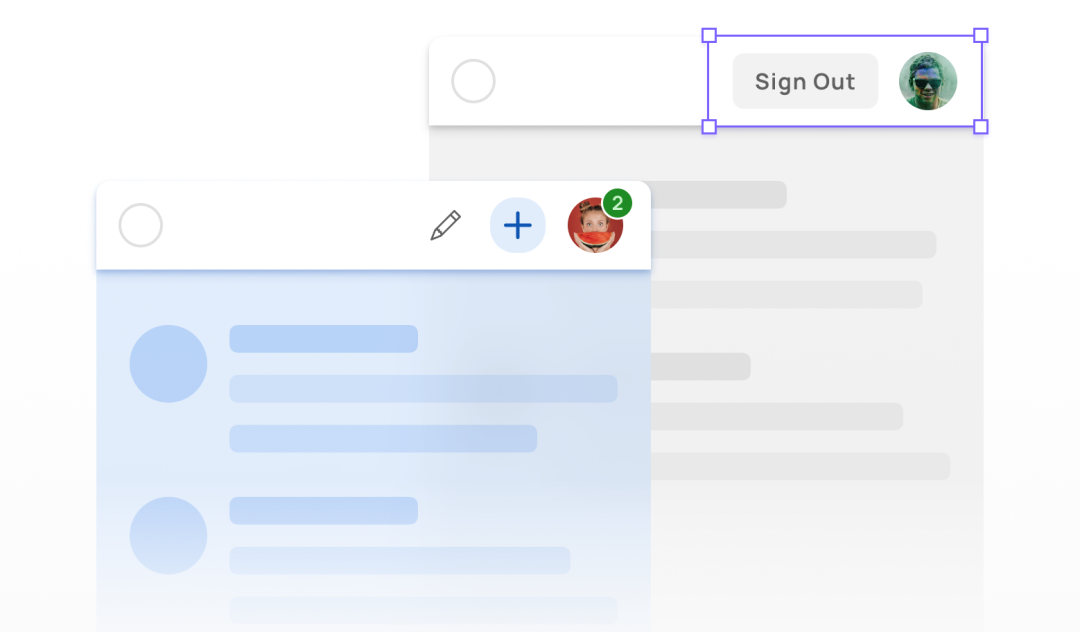
(1) Avatar
If you want to call features related to user attributes, you can put the avatar in the right area of the navigation bar and click to pop up relevant options.
(2) Icon
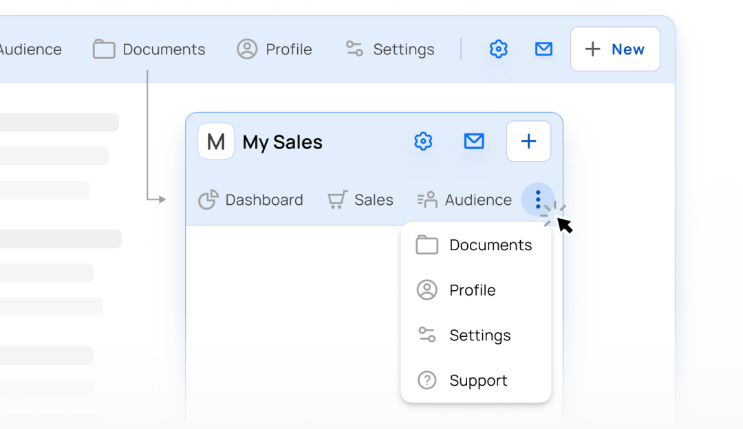
It is the most common design to place action icons in the right area. The actions most frequently used by users, such as message icons and search icons, can be aggregated in the right area of the navigation bar.
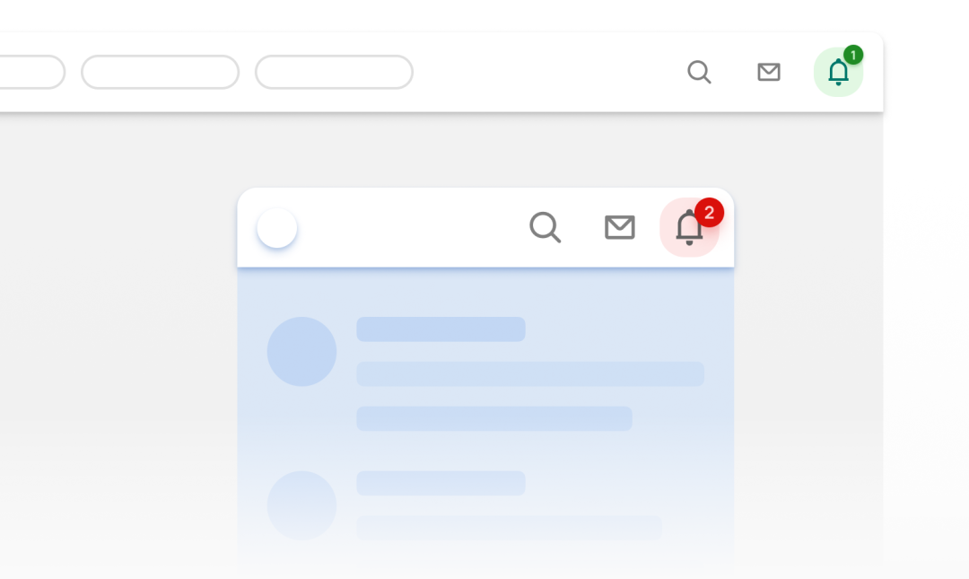
If there are too many icons to be displayed on the right side, these icons can be aggregated, and more actions will appear after clicking.
(3) Button
Buttons can also be placed in the right area to guide the user. When multiple buttons appear, use styles and colors to flexibly distinguish the primary and secondary buttons.
The shape of the button includes circle, square, rounded corner rectangle, etc. the button style includes color filling, stroke, icon and text combination and other styles, which can catch the user's attention through flexible design.
(4) Search box
On the web page, you will see the design of the search box on the right side. The search box is placed on the right side as a separate control or in combination with other controls, which is convenient for users to access quickly.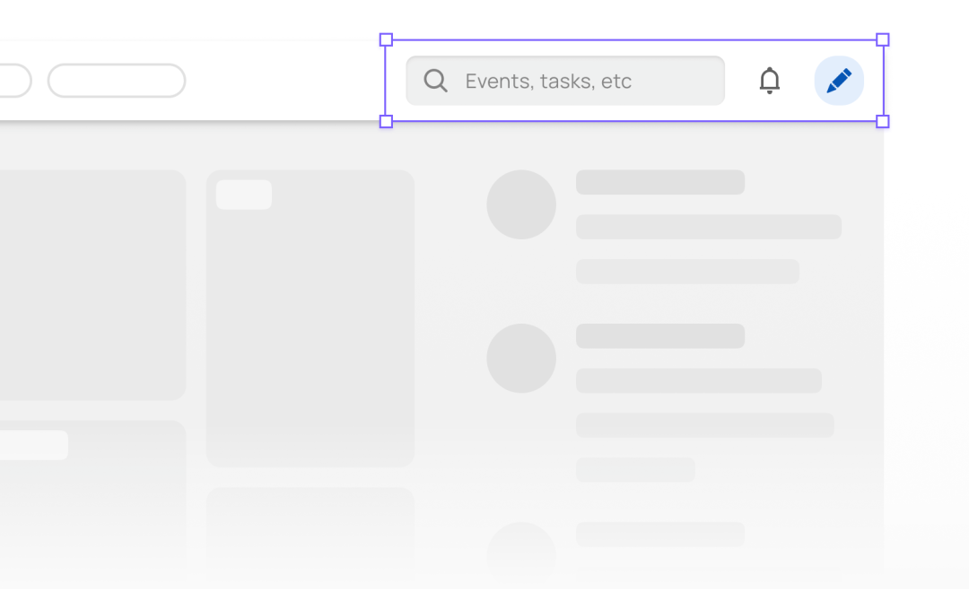
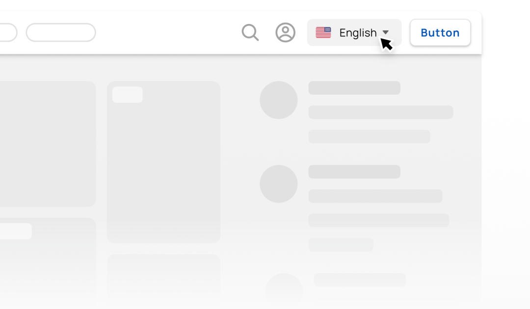
(5) Drop-down menu
On the Pad and the website, you can use the drop-down menu nested on the right side of the navigation bar to switch accounts, languages, and other actions.
2. Five design styles of navigation bar
The top navigation bar design style needs to match the UI of the whole product. The common navigation bar design styles include flat style, shadow suspension style, color filling style, translucent style, etc.
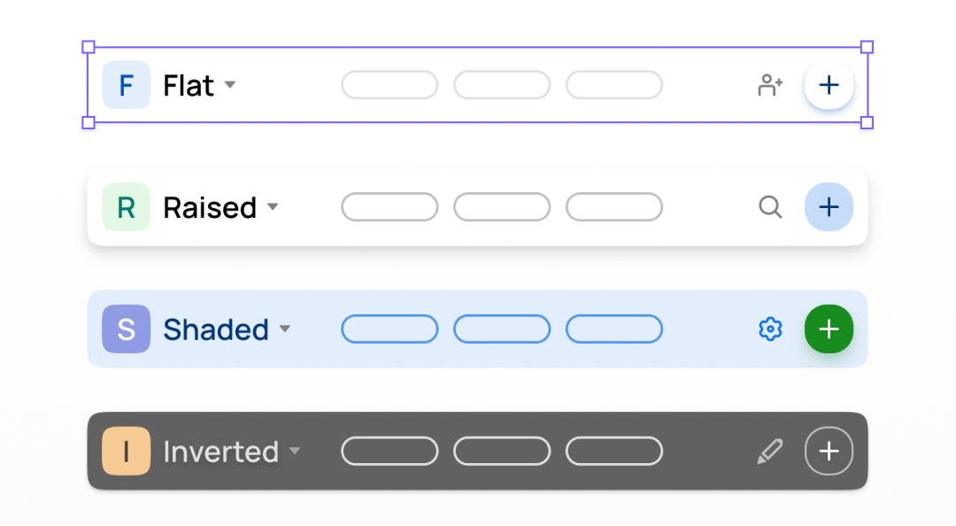
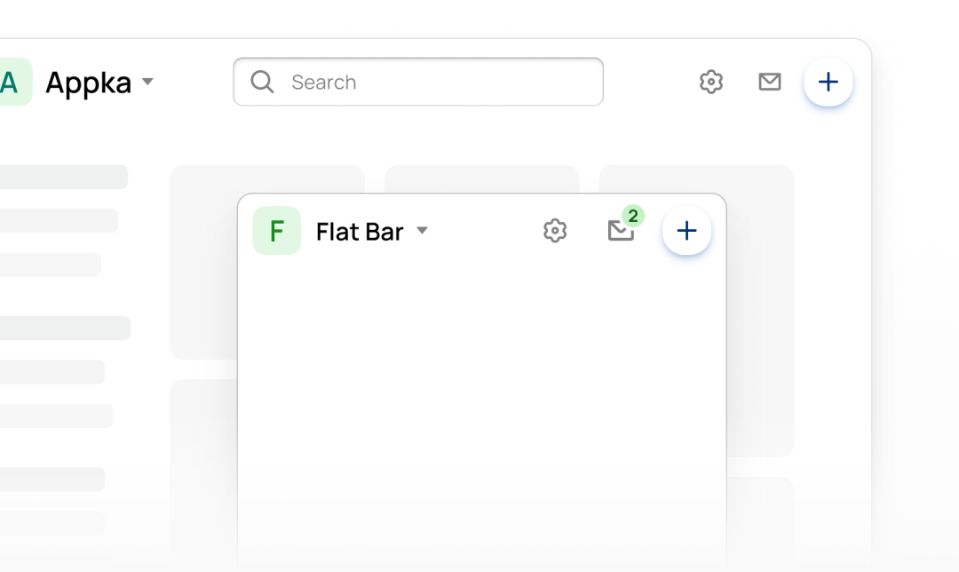
1. Flat style
The top navigation area is completely integrated into the background and integrated with the entire page, making the page look simple.
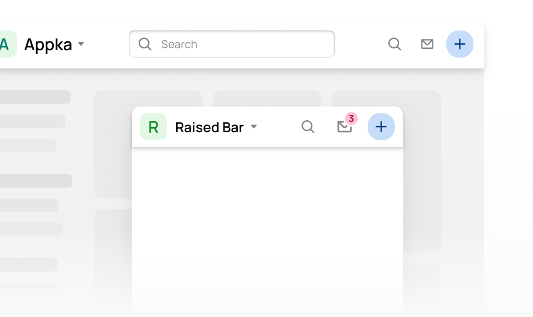
2. Shadow suspension style
By adding a shadow effect under the navigation bar, the navigation bar feels suspended on the page and is easy to distinguish from other contents of the page.
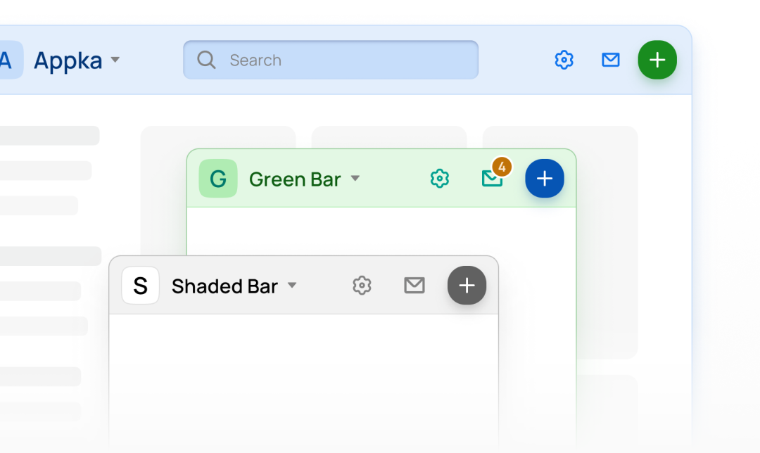
3. Color filling style
Fill the background of the navigation bar with color, reduce the opacity to 8-12%, and use some simple and advanced colors to increase the richness of the page and reflect the characteristics of the brand.
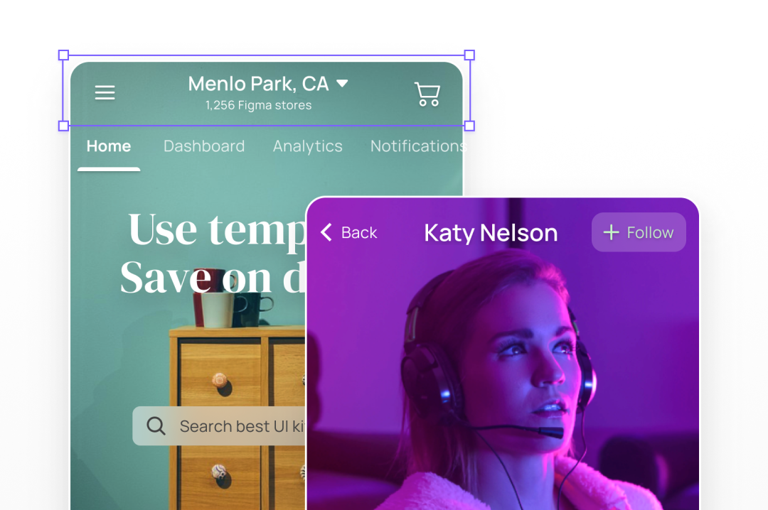
4. Dark style
The background of APP pages is mostly light. At this time, if dark navigation is used, a strong contrast effect can be generated to highlight the content in the navigation.
5. Transparent style
The transparent navigation style is often used in the UI design of the image details page, which can not only prevent the navigation bar from blocking the image content, but also highlight the high-level sense of the page.
3. Analysis of the interaction state of the navigation bar
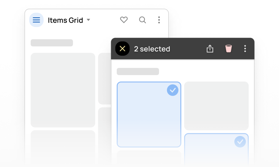
1. Selected state
When the user interacts with the navigation bar, the controls on the navigation bar should be able to dynamically switch to provide users with instant feedback. For example, when the content on the page is selected, the navigation bar should display corresponding action prompts, whether to delete, share, etc.
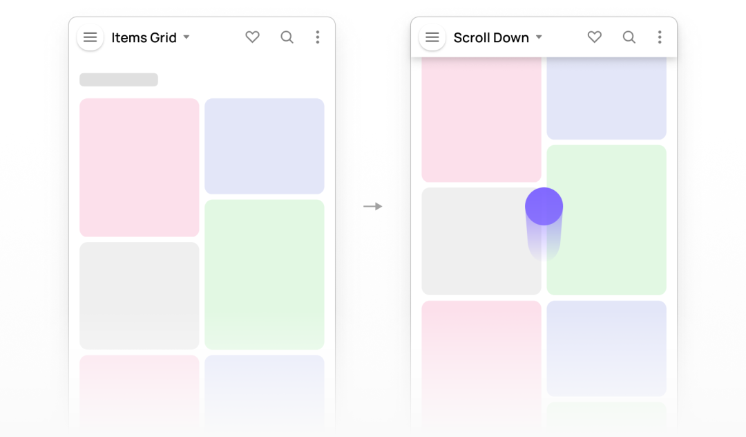
2. Scroll state
When the page scrolls up and down, the originally flat app navigation bar appears the raising effect of shadow suspension. The change of state will make the action look more natural.
3. Blurred background
When the page is scrolled, the top navigation has a frosted blur effect, which is a very popular visual effect now and will make the overall user experience more streamlined.
4. Size adjustment
When the page size becomes smaller, consider collapsing redundant navigation options and hiding them in the overflow icon, which will make the design more reasonable.
4. The end
The above are the key points and design details that can be used in the design of navigation bar. I hope these contents can help you.
If you like the article, please share it with others with page link, thanks for your supporting! ❤


Leave a comment