

Axure Tutorial: Use Widget Style Manager to Apply Typography, Color Palette and Shadows
Introduction
This article is a part of course Axure Full Course: Tutorial, Tips and Templates.
Widget Style Manager allows the styling of widgets to be reused, quickly improving design efficiency and consistency.
It is particularly useful to create the typography, color palette and shadows of design systems (such as Material Design, iOS 16, MUI, Bootstrap, etc.) with Widget Style Manager.
Today we will learn how to use Widget Style Manager, and apply it to create the typography, color palette and shadows.
Usage of Widget Style Manager
Apply widget style manager to widgets
It will be very convenient to use the Widget Style Manager to style widget. You just need to select the widget, then select the style from the Widget Style drop-down list. The system will preset several styles, you can also create your own styles.
Create your styles to Widget Style Manager
There are two creation methods:
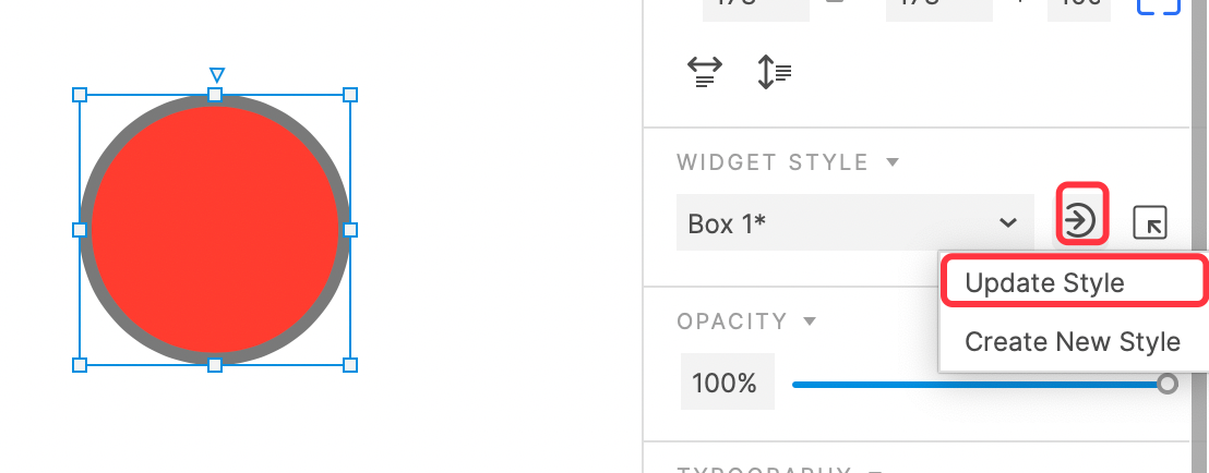
1. Directly set the widget style, click the Update or create style button on the right, and then select the Create New Style option.
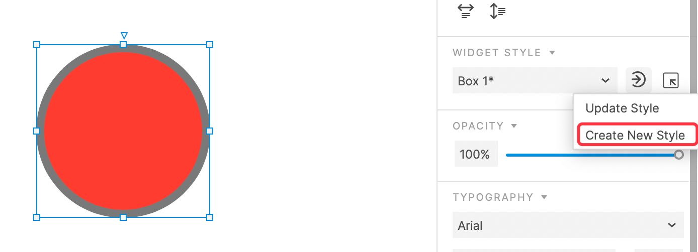
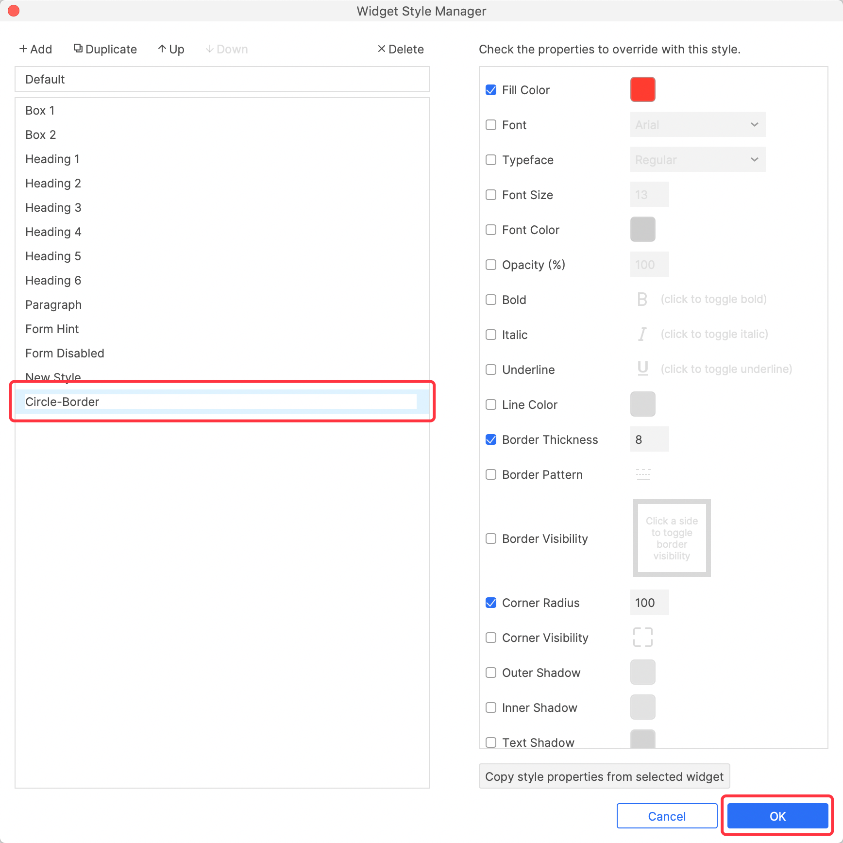
In the pop-up Widget Style Manager window, edit the newly created style name and click OK to save the settings.
2. Click the +Add button in the Widget Style Manager to add a new style directly, The method is the same as above.
Widget Style Manager UI introduction
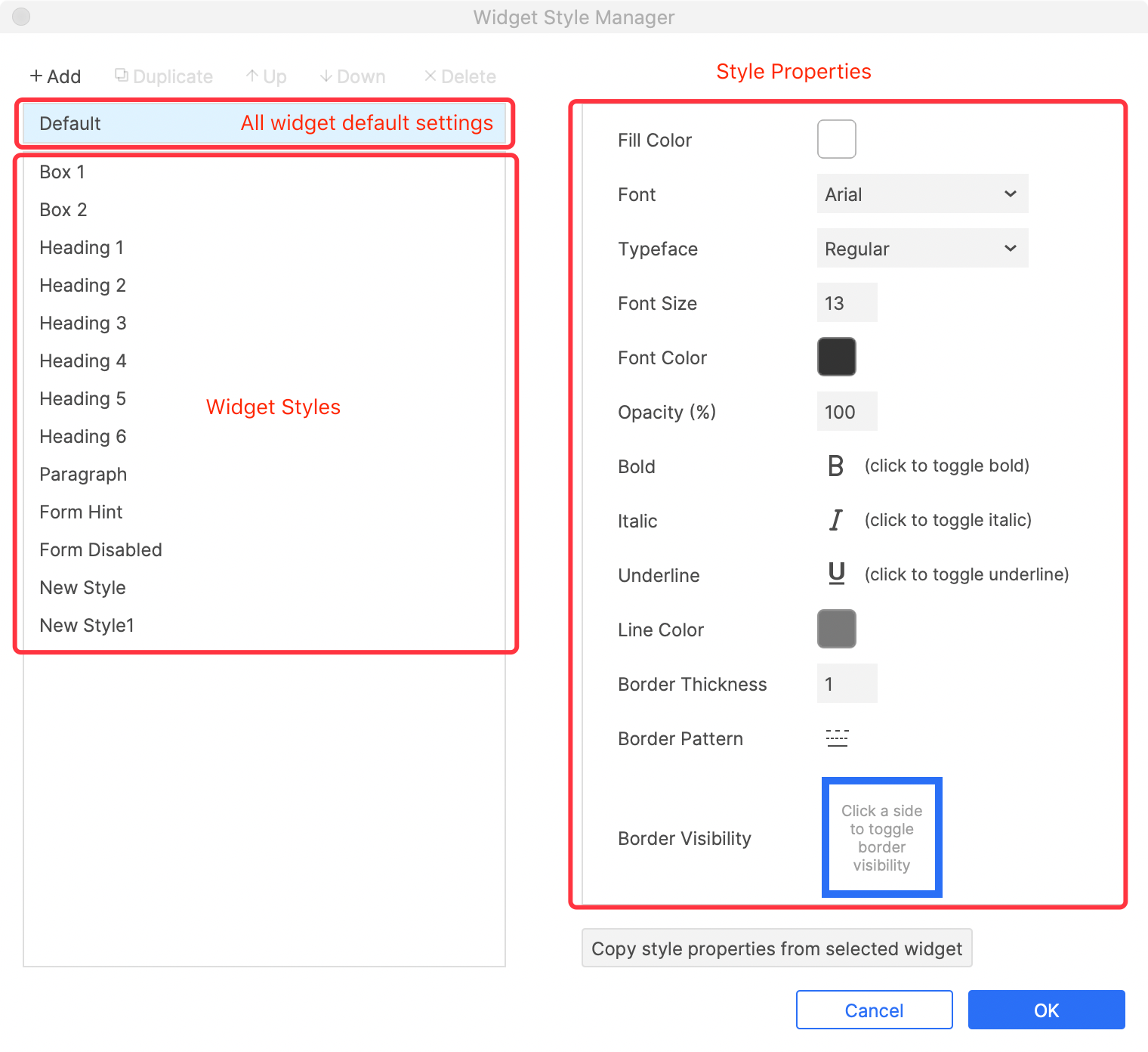
Default properties of all widgets UI
Default: The default style properties of all widgets. After clicking this button, you can modify the properties on the right side.
Widget Styles: The system default and custom created styles are shown here. After clicking the option, you can modify its properties on the right side.
Style properties: the interface will be different according to the selection of default or widget styles. The above image shows the default interface.
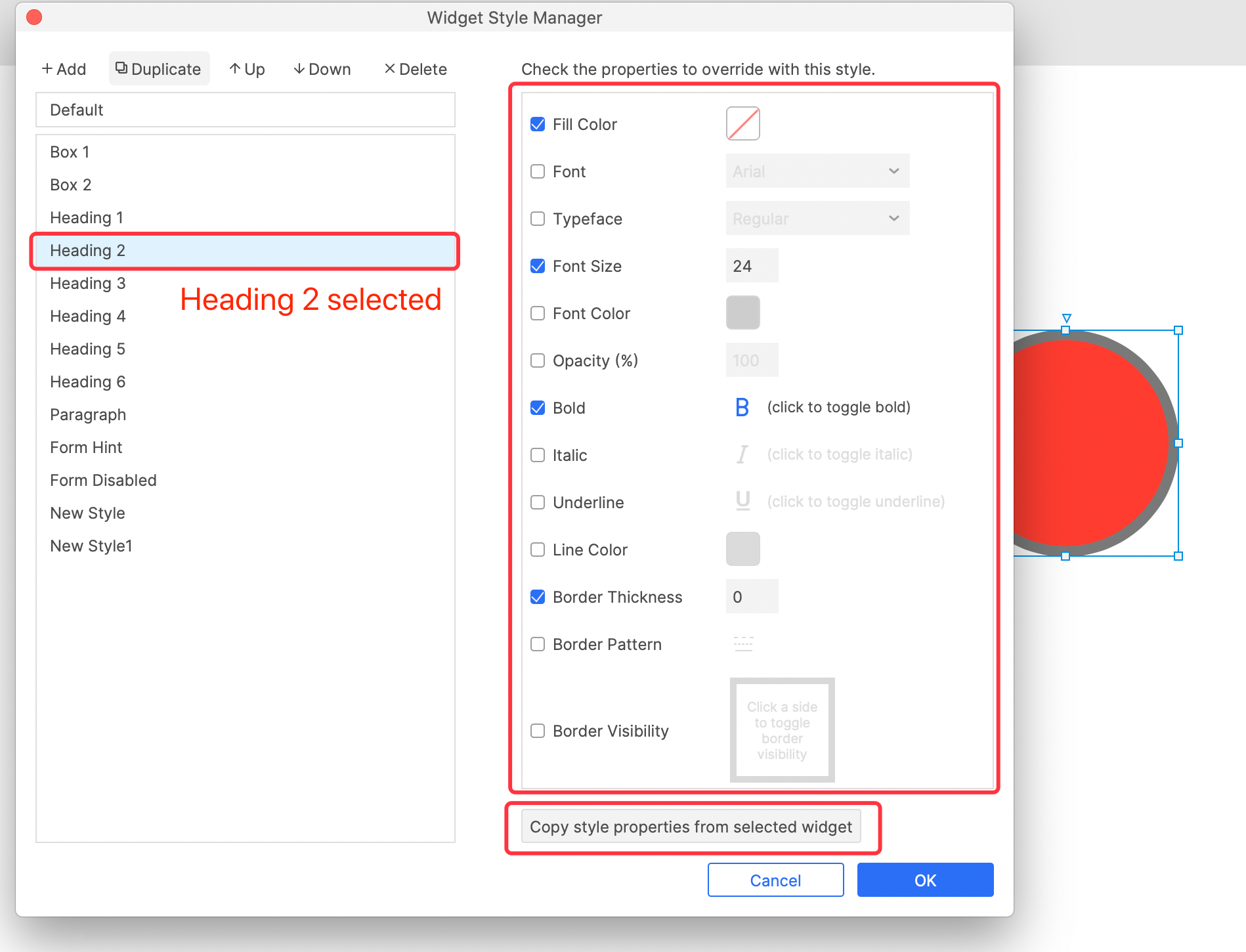
Widget Style Manager interface when Widget Style (Heading 2) is selected
When the Widget Style option is selected, the Style properties that can be checked and unchecked will be displayed on the right, and you can edit these property values.
Copy style properties from selected widget: After clicking this button, the selected widget properties will be copied to this Widget Style option.
Update Style to Widget Style
If you make changes to the style of the widget (indicated by * in the pane on the right), you can update the Widget Style applied to this widget.
Duplicate, reorder, and delete Widget Style
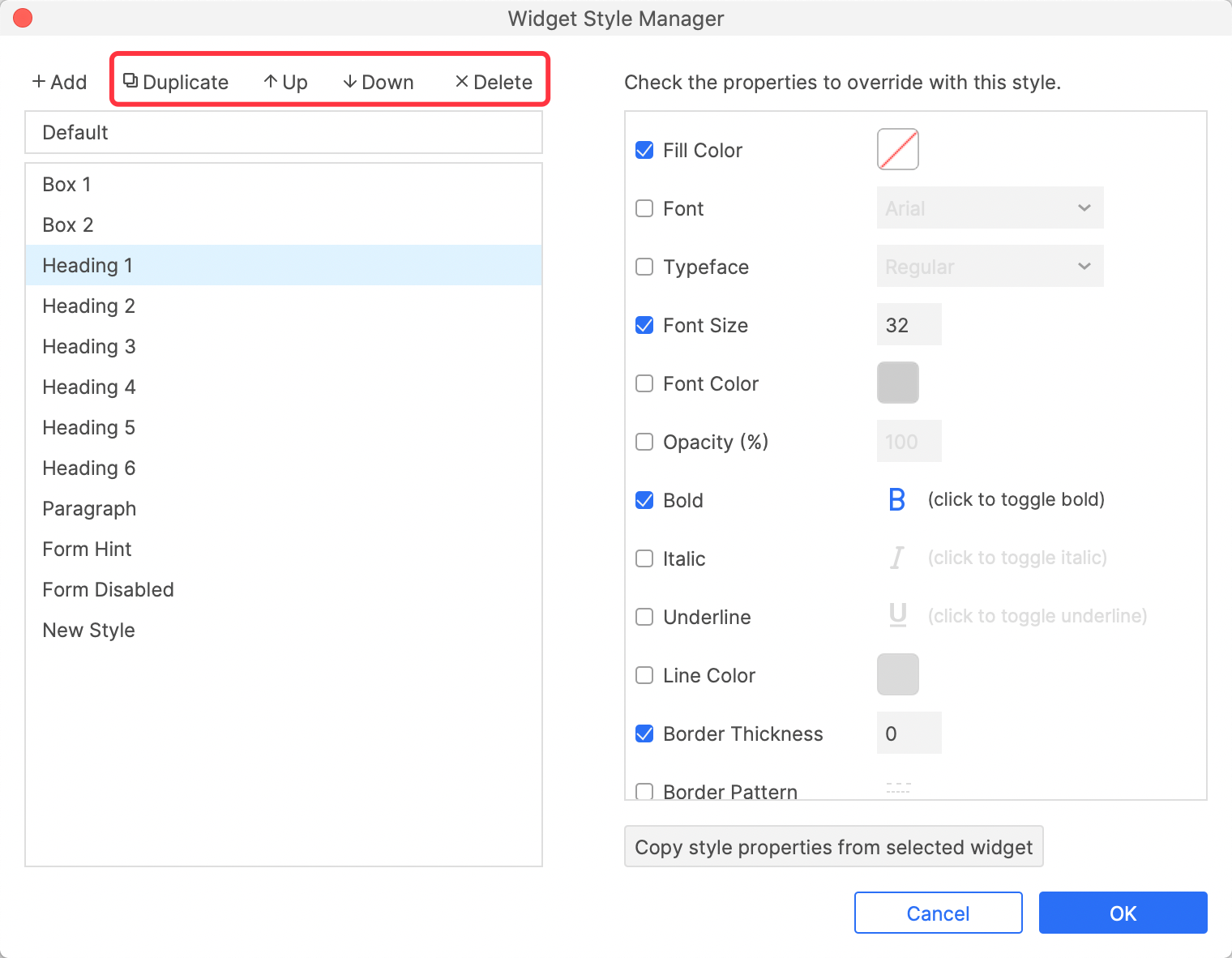
Select the widget Style and click the button at the top to duplicate, reorder and delete it.
Create and Apply Typography with Widget Style Manager
Generally speaking, all design systems will have typography as a global attribute. Through widget style manager, you can quickly create typography and apply it to future designs. Next, take the typography of Bootstrap 5 as an example to demonstrate how to create and apply typography in Axure RP.
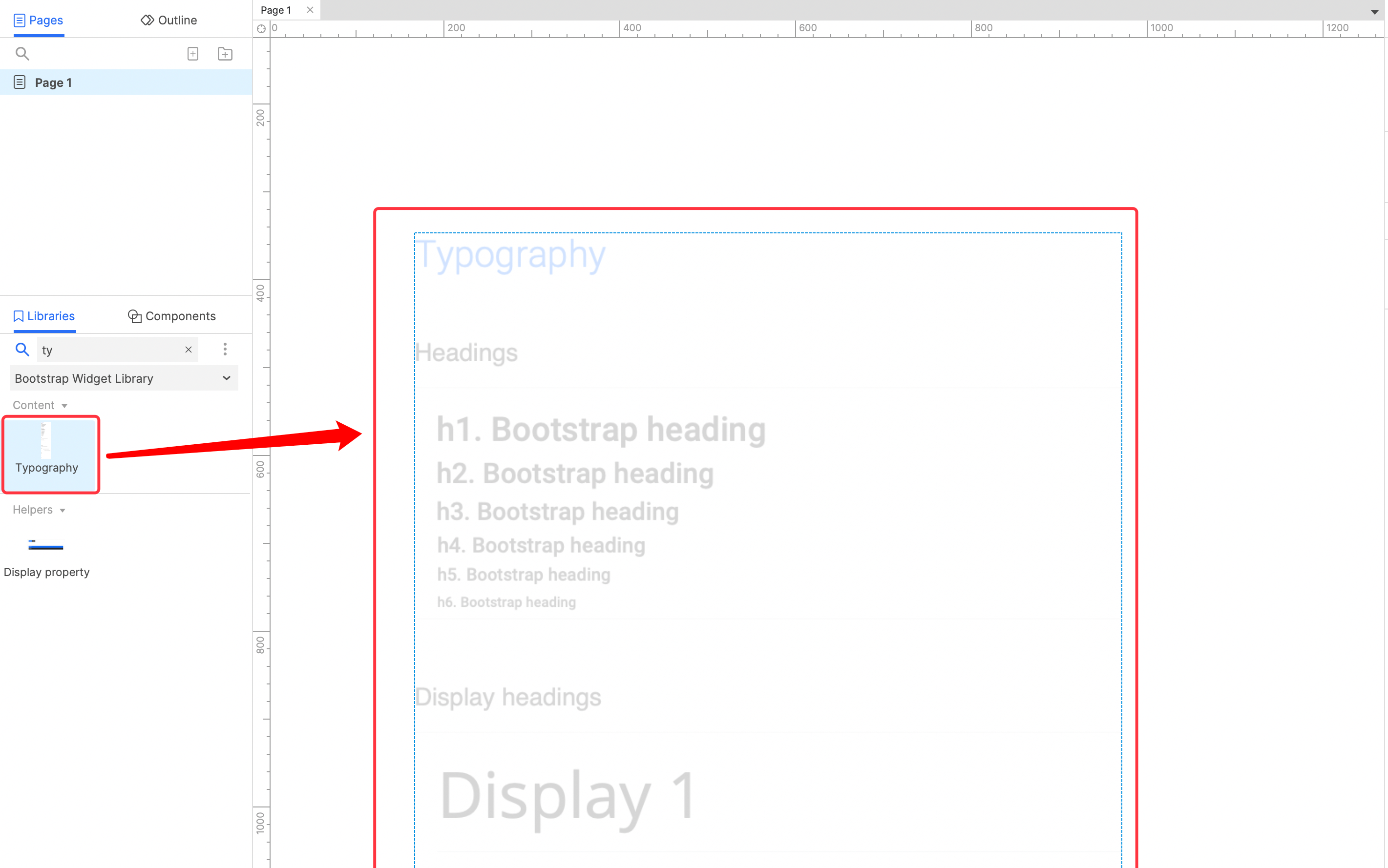
1. First load the Widget Library of Bootstrap 5, search for Typography, and drag the corresponding widget into the canvas.
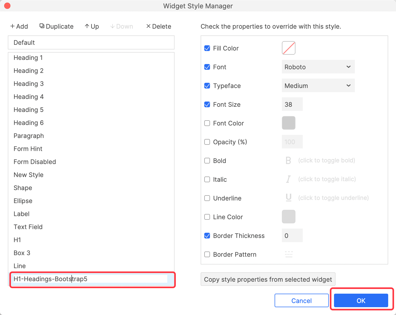
2. Select the h1.Bootstrap heading text, click the button on the right, and select the Create New Style option.
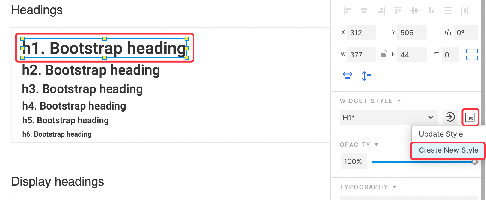
3. In the pop-up Widget Style Manager window, name the newly created Widget Style H1-Heading-Bootstrap 5, click the OK button to save.
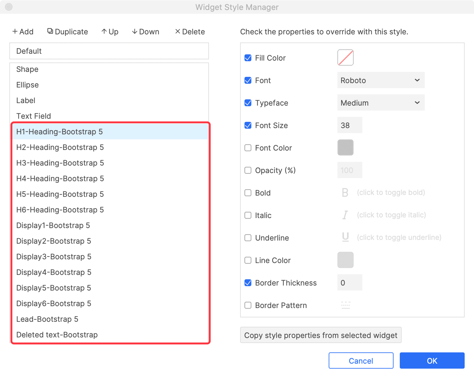
4. And so on, create all text styles as Widget Styles.
Apply typography to text
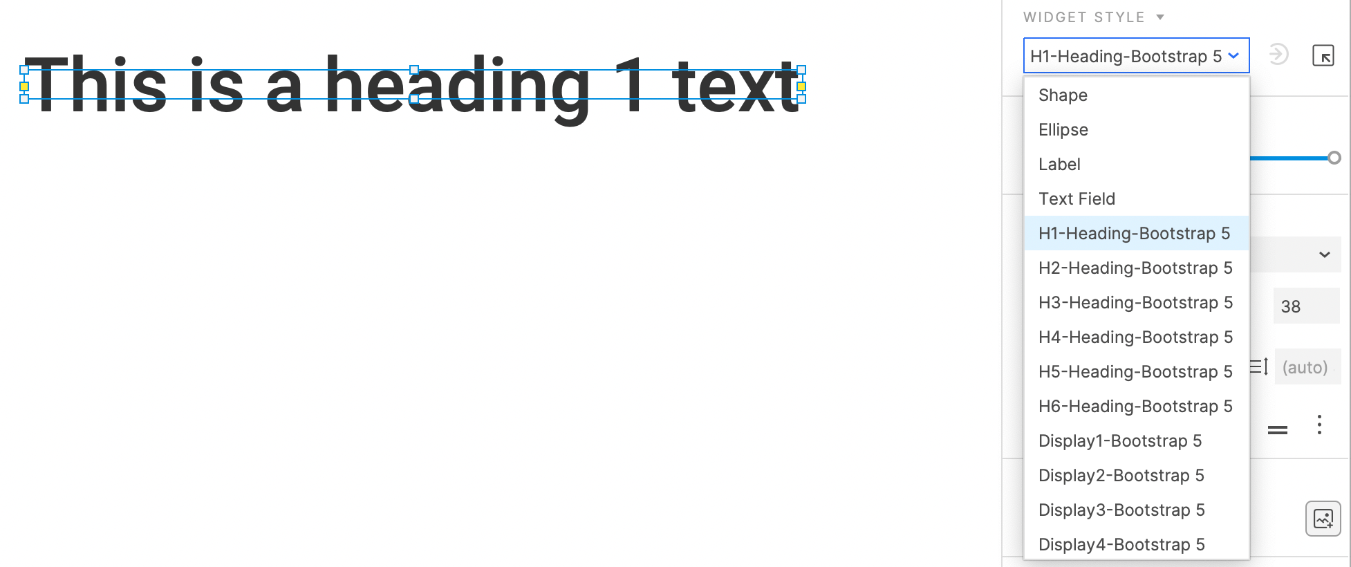
Very simple steps, you just need to select the text, and then select the corresponding Widget Style style in the right pane.
Create and Apply Color palette with Widget Style Manager
Generally speaking, all design systems will have palette as a global attribute. Through widget style manager, you can quickly create color palette and apply it to future designs. Next, take the color palette of Bootstrap 5 as an example to demonstrate how to create and apply typography in Axure RP.
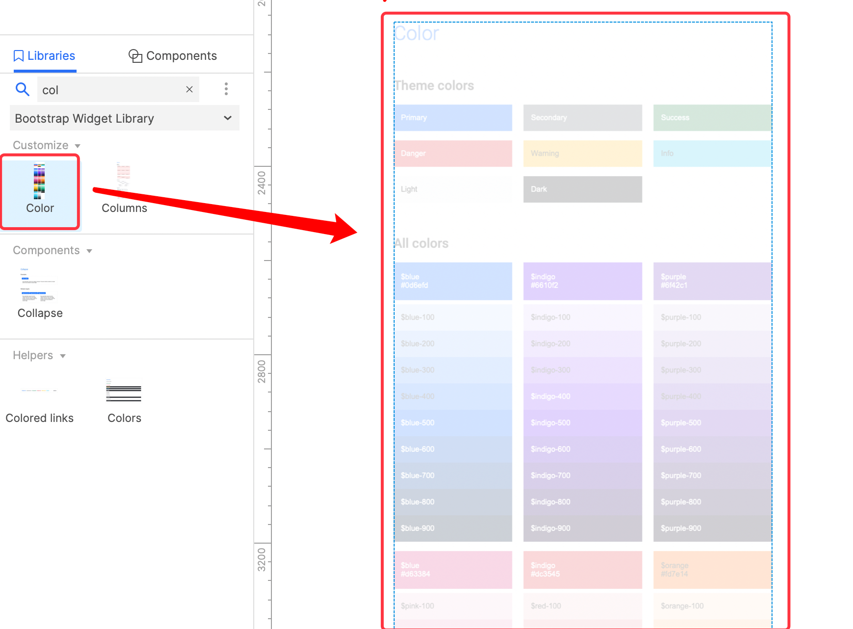
1. First load the Widget Library of Bootstrap 5, search for Color, and drag the corresponding widget into the canvas.
2. Select the Primary color widget, click the button on the right, and select the Create New Style option.
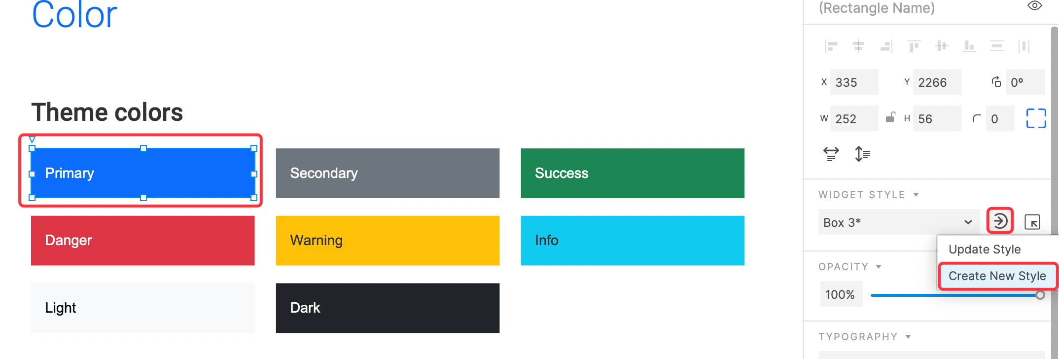
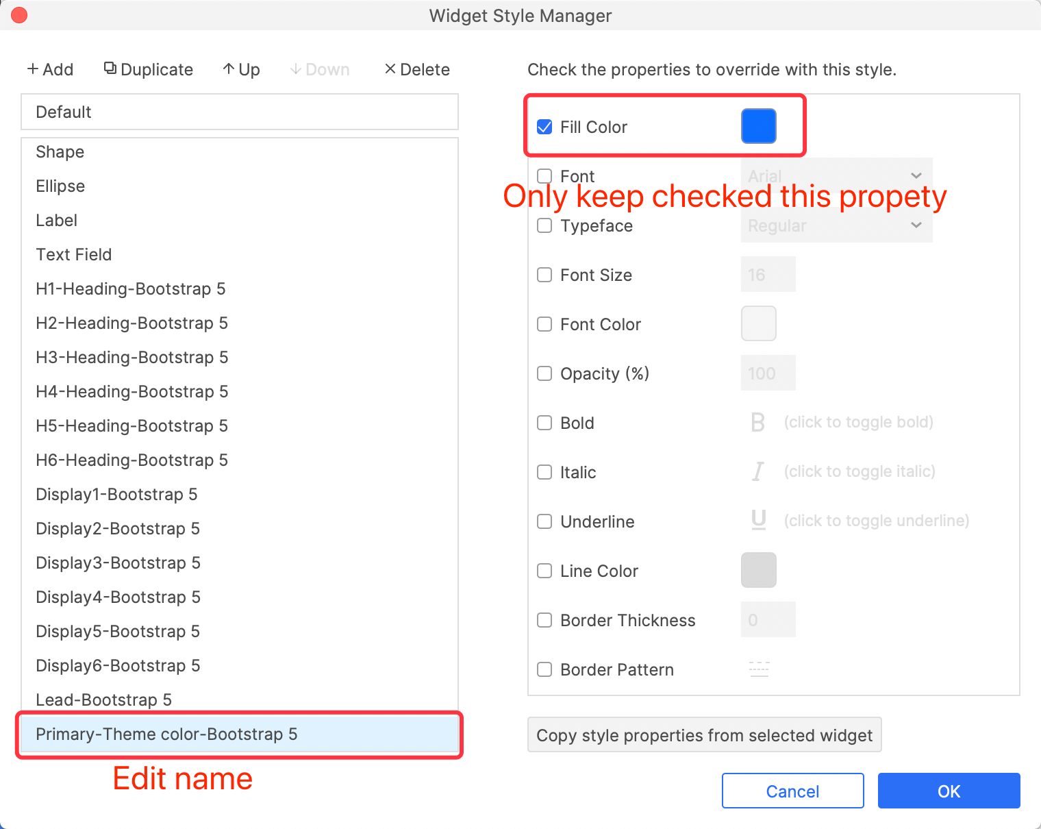
3. In the pop-up Widget Style Manager window, name the newly created Widget Style Primary-Theme color-Bootstrap 5, then leave only the Fill Color property checked, uncheck all other properties, and finally click the OK button to save.
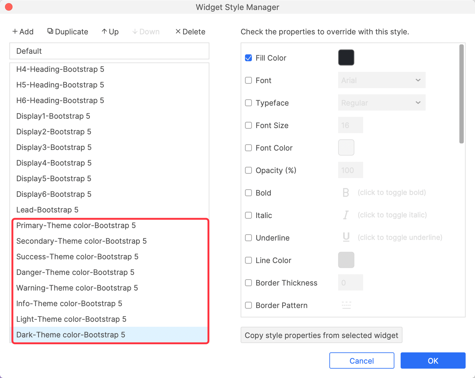
4. And so on, create all color styles as Widget Styles.
Apply color to widget
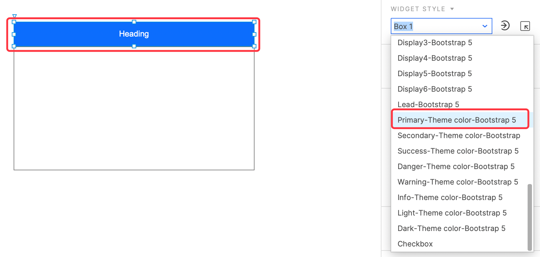
Select the widget, and then select the corresponding Widget Style style in the right pane to apply color.
Create and Apply Shadows with Widget Style Manager
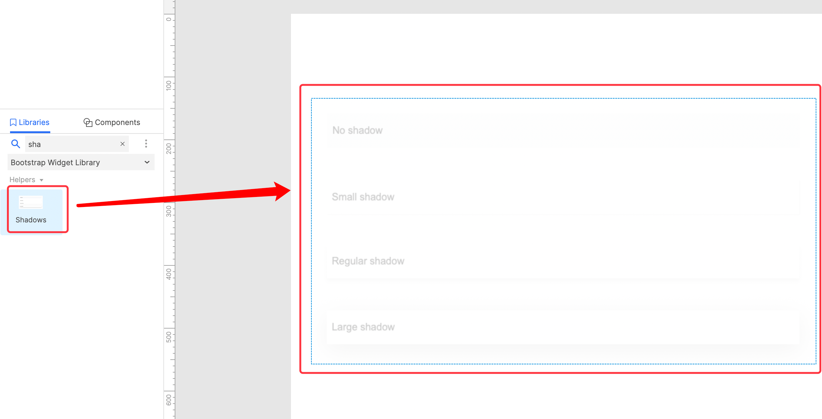
Some design systems use shadows to represent elevation. Through widget style manager, you can quickly create shadows and apply it to future designs. Next, take the Bootstrap 5 shadows as an example to demonstrate how to create and apply shadows in Axure RP.
1. First load the Widget Library of Bootstrap 5, search for Shadows, and drag the corresponding widget into the canvas.
2. Select the Small Shadow widget, click the button on the right, and select the Create New Style option.
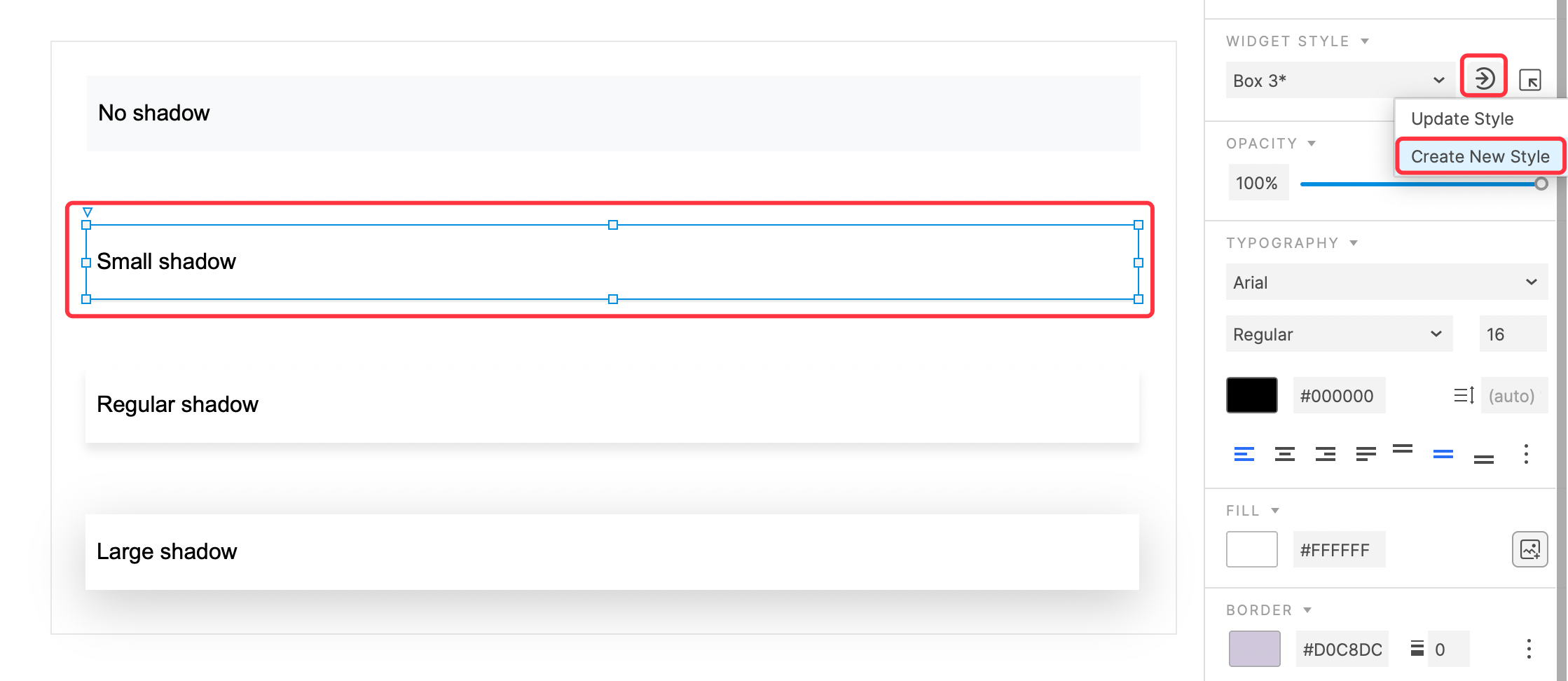
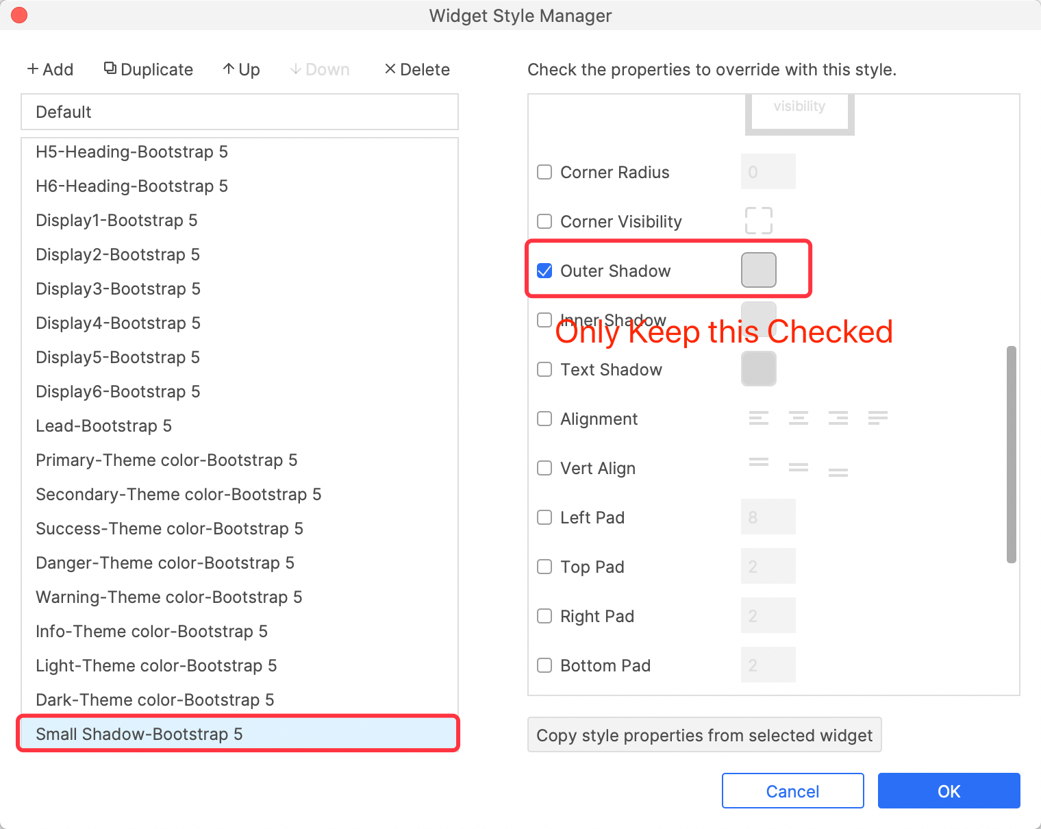
3. In the pop-up Widget Style Manager window, name the newly created Widget Style Small Shadow-Bootstrap 5, then leave only the Outer Shadow property checked, uncheck all other properties, and finally click the OK button to save.
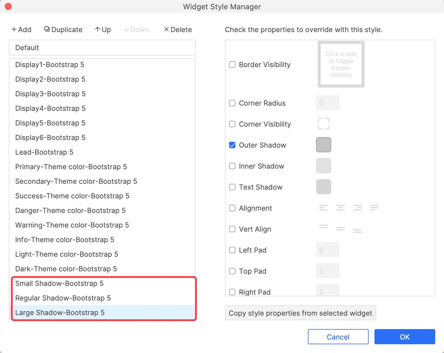
4. And so on, create all shadow styles as Widget Styles.
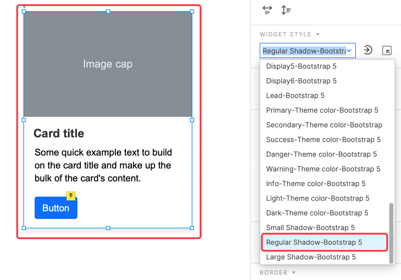
Apply shadow to widget
Select the widget, and then select the corresponding Widget Style style in the right pane to apply shadow.
That's all for today's lesson. Next lesson we will introduce how to add interactions to widget.
If you have any questions and suggestions, please leave a message.
If you like the article, please share it with others with page link, thanks for your supporting!
Well Joe @AxureBoutique, a technology writer and teacher, focuses on Axure prototype design and product design.


Leave a comment