Summary of "User Habits" for Designers
Introduction
Excellent designers often try novel interaction ways and visual effects, but occasionally the designed products do not meet the user's habits. Innovation based on user habits is a good experience.
At present, everyone talks about user habits, but user habits cannot be based on designers themselves.
Although designers often talk about user habits, it is difficult for anyone to say what user habits are. How do we judge whether the design we make is in line with user habits? Are user habits always unchangeable?
I know the truth, but I can't do it. In fact, it is, because it largely depends on the designer's understanding of user habits.
User habits themselves are difficult to quantify, but it does not mean that it is a vague concept.
You can still see from the analysis of user feedback and operation behavior data comparison. User habits can be improved with the improvement of designer's learning, experience and vision.
1. What are user habits?
In psychology, a habit is a human need or tendency to automatically perform a certain action in a certain situation.
In other words, a habit is a relatively stable and automatic behavior formed by people in a certain situation.
Habit formation is the result of learning and the establishment, consolidation and automation of conditioned reflex.
Therefore, habit has two characteristics.

It should be noted that there is no clear time limit for "long-term" itself, and multiple repetitions are emphasized.
The habit here focuses on describing "acquisition", that is, people form it through experience, learning and deliberate practice, so this habit can be changed in theory.
In addition, habit has a hidden characteristic, which is different from the "acquisition" described above. It is an innate and species-specific behavior pattern.
For example, when people are fasting, smelling fragrant food will produce a strong appetite. This characteristic habit is inscribed in the genes and can hardly be changed.
Just imagine, when we use the app, have we ever encountered a situation where we feel uncomfortable because of habit?
One of the most common examples is the software shutdown methods of Windows and Mac OS.
When using Windows computers, we form a natural habit of close the window in the upper right corner.
Later, when I started using a Mac computer, the way to close it was in the upper left corner. For a period of time, I felt very uncomfortable every time I closed it.
The shutdown mode of MAC has no obvious experience upgrade than windows, and the cost of changing operation habits is high. Some users may think that the shutdown action of MAC is not easy to use.

Of course, if you start with a Mac computer and then use a Windows computer, you will naturally think that Windows is not easy to use.
This is a preconceived concept. Once habits are generated, changing habits will produce a certain learning cost.
2. Generation of user habits
Designers need to think about the nature of user behavior and minimize subjective judgment.
Products are for people to use, so it is important to understand people's behavior characteristics.
As long as it involves the understanding of human itself, it is extremely complex. Human beings have far less understanding of their own behavior characteristics, but this does not prevent us from making some analysis and judgment with our existing knowledge.
The generation of user behavior habits is closely related to the characteristics of memory. We can divide memory into explicit memory and implicit memory.
Explicit memory is more accustomed and easy to perceive.
For example, the texts, formulas and rules we recite in school can be described in explicit ways such as language and words.
Implicit memory is also called non-declarative memory, which we cannot describe with behavior but does exist.
For example, riding a bike is hard to forget after learning it.
At the beginning of learning, it will require conscious intervention, and after many practice, the behavior will gradually "automatic".
For example, when learning to drive, we will be very focused, and after getting used to driving, we can chat while driving.

What we usually call muscle memory and conditioned reflex are also closely related to implicit memory, and once formed, they are not easy to change.
It should be noted that muscle memory is only a simple description. The cerebellum is responsible for this memory. In fact, muscle has no memory.
So sometimes, when we experience an app, we will habitually look for a certain feature on a certain page.
Or feel that the experience is different from other apps, which may be caused by the user habit of implicit memory.
For example, one day you just use an unused app. When you want to find the settings feature, you will probably unconsciously click the last tab of the bottom tab bar (such as "User Center").
Because most of the app's settings feature are in this position, users naturally form a habit.
Here I'll use terms first coined by psychologists Keith Stanovich and Richard West to describe two systems in the brain, System 1 and System 2.
- System 1 operates automatically and quickly, with little or no effort and no sense of voluntary control.
- System 2 allocates attention to the effortful mental activities that demand it, including complex computations. The operations of System 2 are often associated with the subjective experience of agency, choice, and concentration.
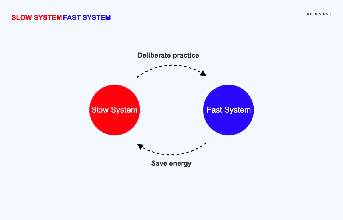
These two systems can be transformed into each other. The slow system injects new habits into the fast system through deliberate practice. At this time, the fast system is the expression of habits.
In this way, the fast system can complete most of the work in daily life, which is what we often hear that practice makes perfect.
Habits can often help us save thinking energy, which makes the slow system further inject more good habits into the fast system through deliberate practice.

For example, when you first use an app, you may need to experience where the feature you want is in the app.
But after you use it for a long time, you will find it without thinking.
Just like you use Facebook, the most commonly used features may be sending messages and watch feeds.
However, if someone asks you to find the entrance of "Fundraiser" in Facebook, you may first think about what entrance may appear, which is caused by less use at ordinary times.
3. Avoid changing user habits
1. Risk of challenging user habits
Since the characteristics of user habits are "long-term cultivation" and "not easy to change", challenging user habits will certainly cause discomfort and even strong disgust.
A few years ago, the logo of Ins was revised, the logo was changed from quasi-physical to flat, and the color also changed.
2. How to avoid challenging user habits
1) Who are the users of the product?
Understand who the users of the product are and what the behavioral characteristics of the users are.
Different products have different user groups due to different positioning, and different user groups naturally represent different user behavior characteristics.
If the designer knows the user group, but does not know the specific behavior characteristics, you can try to let the users around you help you.
For example, the overall user portrait of Tiktok is relatively younger, so in terms of product design, both the representative image, UI style, and interactive experience are more youthful.
The user group of the Google is mainly middle-aged and elderly people, so the design will not look very young, but mainly focus on clear operation, large font size, and removal of redundant information.
2) Focus on the experience of competitive products
It is important to pay attention to the user experience of mainstream products. The action of these competitive products often represents the user's habitual action (or cultivated habitual action).
In most cases, you need to know how far competitive products can achieve, and users can easily bring habits from one scene to another similar scene.
For example, when viewing news, some users may go to Yahoo and others may go to MSN, although the websites are different
However, in user habits, the action modes are similar, so if you want to make the user experience not abrupt, you often follow similar action logic.
Of course, these are not to make one product copy another product, but to pursue a better user experience. Your product has a better experience than competing products, and it will be more attractive to users.

3) Understand human behavior / reading patterns
Everyone will have relatively stable behavior, action and information reading habits.
The products we can see with good experience are in line with the basic behavior habits and information reading habits of users.
To understand these habits, we need to understand the characteristics of deep-seated interactive behavior.

In terms of actions, it is necessary to understand the behavior habits of user interface interaction.
For example, the user's action (gesture action, how can the information layout be easy to act), such as Nelson's usability principle, etc.
From the perspective of information reading, we need to consider the law of people's eyes observing things.
For example, Gestalt principle: similarity, continuation, closure, proximity, figure/ground, and symmetry & order.

4) Understand system design specifications
In terms of the field of mobile Internet products, everyone interacts with mobile phones.
At present, the two major mobile phone systems: iOS and Android also each provide clear guidance on human-machine interface design.
In particular, Android material design plays a great role in designers' rapid understanding of design specifications and design principles.
Links to Human Interface Specifications for iOS and Android:
- iOS: https://developer.apple.com/
- Android: https://material.io/


4. Develop new user habits
1. When to develop new user habits?
We mentioned that there are risks in challenging user habits, but user habits are not immutable forever.
Before the rise of the mobile Internet, everyone took taxis offline, but Uber has subverted the traditional user habits of offline taxis.
In the past, everyone paid in cash, but Alipay overturned the user habit of cash payment.

In The Design of Everyday Things, there is this passage:
Consistency in design is virtuous. It means that lessons learned with one system transfer readily to others. On the whole, consistency is to be followed. If a new way of doing things is only slightly better than the old, it is better to be consistent. But if there is to be a change, everybody has to change. Mixed systems are confusing to everyone. When a new way of doing things is vastly superior to another, then the merits of change outweigh the difficulty of change. Just because something is different does not mean it is bad. If we only kept to the old, we could never improve.
1) The value of change outweighs the difficulty of change
The value here includes but is not limited to user value, business value (short-term value, long-term value), etc.
When new design require users to change old habits, how much value does this design bring? Is it worth the learning cost for old users.
Sometimes, knowing that the change will cause strong resistance from users, designer still want to change the user's habits, perhaps because the value of the change outweighs the difficulty of the change.
In the example of Ins mentioned just now, some people don't know why Ins should be revised.
Remy Jauffret, head of communications design at innovation consultancy IDEO, said:
"When a brand or organization goes beyond its original business intention, or expands its business to provide different products, or leaders want to attract new customers, these situations may require a new brand vision. Changes are always uncomfortable and then subside. I think time is the only criterion to test the truth."
2) Changes bring obvious experience upgrades
In our design, we sometimes encounter a poor feature experience of our products, but it lasted for a long time.
Other similar products in the market have done well in the experience of the same function. Can we revise to the mainstream interactive experience?
At this time, we need to weigh whether the change can bring obvious experience upgrading, or whether it is a subtle change for users, which can be changed or not?
Taking Android as an example, a few years ago, there were 3 physical keys at the bottom of Android phones, and later the phone was updated and iterated, becoming a virtual three-button design.
Therefore, there are three hot zones at the bottom.
Users are more accepting of the iOS experience, and Google later allows the existence of the bottom tab bar in Material Design.
This is equivalent to inconsistent with the original user habits, but it brings a better user experience.

2. How to cultivate new user habits?
Here, it is explained in conjunction with the trigger, action, variable reward, and investment of the addiction model. These 4 steps are a cycle.
1) Trigger: external trigger and internal trigger
To put it bluntly, the external trigger is to strengthen the product exposure, so that users can think of you at once.
For example, what is the next sentence of "Work hard"? You probably think of "Play harder".
After a long-term external trigger, it has finally turned into an internal habit, which will make you remember deeply.
- Paid trigger: advertising and search engine promotion are paid triggers to win new users;
- Feedback trigger: trigger in public relations, media and other fields, such as positive coverage and recommendation of products;
- Interpersonal trigger: word of mouth communication between acquaintances is an extremely effective external trigger, which can bring "viral growth" to products;
- Autonomous trigger: focus on driving users to repeat certain behaviors, so that users can form habits, such as news subscription, alarm clock every morning, etc.
Internal trigger is the motivation generated by users to drive them to use a product.
When a product is closely related to your thoughts, emotions or existing routine activities, it must be the internal trigger at work.
For people who are used to twitter feeds, picking up their phone will inadvertently open twitter.
Dr. Fogg from Stanford University once proposed the "Fogg formula", and the Fogg behavior model can be represented by a formula, that is, B = MAT.

Trigger: external trigger and internal trigger mentioned above.
Dr. Fogg believes that there are three main motives that drive us to take action: pursuing happiness and avoiding pain; Pursue hope and escape fear; Pursue identity and avoid exclusion.
Ability: what we want to detail here is ability.
The so-called habit refers to the actions that people take almost unconsciously.
The simpler the action cost, the lower the memory cost, and the easier it is to form user habits.
For example, Watching Tiktok is the scene where user behavior costs are very low.


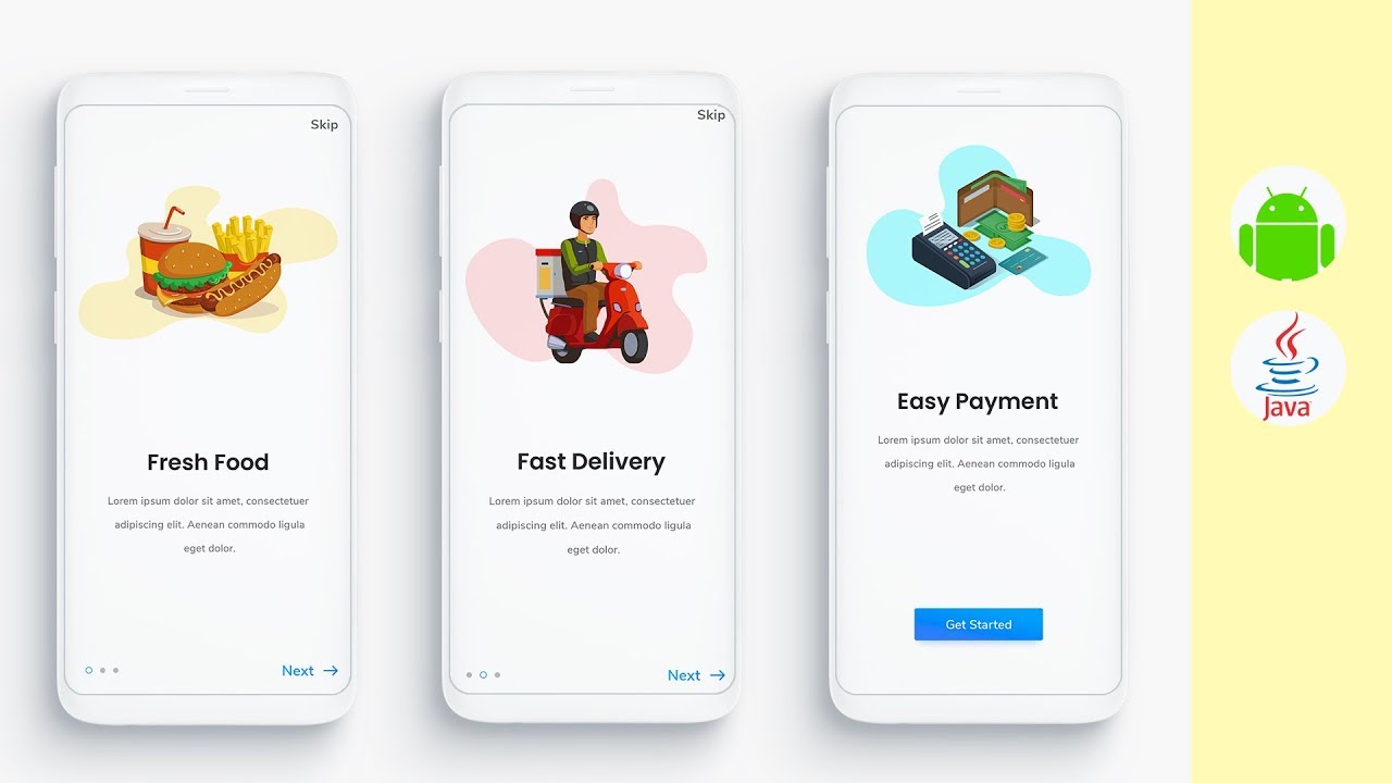
Onboarding sliders: this method is more common, but you should still pay attention to avoid cumbersome action instructions. Do not use the action instructions as a solution for poor experience.

It is allowed to switch between old and new versions: this method is generally that the revision changes too much, and users are not easy to accept the new experience method at a time. It is common on websites, but it is only applicable to the transition period.
Of course, in addition to the above methods, there must be other ways to make changing behavior more comfortable, which are not listed here.
3) Variable reward
Variable reward is mainly manifested in: social reward, prey reward and self reward.
These rewards will strengthen the user's habit of using the product.
Social rewards: interpersonal rewards that people get from products through interaction with others.
Such as being recognized, valued, loved, etc. For example, people like to send messages, hoping to get feedback, to some extent, in order to get social rewards.
Prey reward: The specific resource or information that people obtain from a product.
For example, browsing information feeds, rich information feeds provides users with information.
For example, with Tiktok, people's pursuit of video freshness and content richness belongs to prey reward.
Driven by goals, we will overcome obstacles, even if only because the process can bring satisfaction.
However, if the user has no investment, that is, the replacement cost is low, it may be replaced by other products at any time.
For example, in the era of social Internet, Facebook entered the game early, and people's relationship chains were precipitated in Facebook.
That is, the more people use Facebook, the more precipitation in the relationship chain, and the more difficult it is to replace other products.
The more willing users are to invest, the higher the user stickiness is, and in the process, user habits will continue to strengthen.
5. Conclusion
At this stage, everyone talks about user habits, but user habits do not take themselves as the standard, but need to consider the behavior characteristics of product users and the deeper habits that people have not found when using products.
This requires designers to have a deep understanding of the generation, judgment and cultivation of habits.
Under normal circumstances, the product is not suitable for rashly changing the user's habits, but in the case of special needs, it is inevitable to change the user's habits of the product.
Of course, we need to make it easier for users to accept.
Most product managers want users to form a habit of their own products.
Therefore, we need to understand how users have habits and strengthen habits to make products more attractive, but good and positive user habits must be based on user experience.
If you like the article, please share it with others with page link, thanks for your supporting! ❤


Leave a comment