
Key Points of Building Website Pop-up Window and 8 Interesting Cases
Summary
The main points of building a pop-up window: who to see, purpose, timing, points for attention in content and design, what is the final purpose.
1. How to make a pop-up window
Pop up window is a window message that automatically pops up on the user's screen.
So, what are the specific points to pay attention to when building a pop-up window?
First, figure out who the pop-up is for. Combine your own data or the refined operational tools you use to classify users. Classification methods such as:
- Sources: advertising, social networks, search engines, direct access, external links.
- User awareness and recognition of the product: new visitors, purchased users, returning users.
- According to the user's behavior on the site: gender, age group, focus on the product.
The above categories can also be combined to obtain a more accurate understanding of a type of user. For example: These users are all from FB and have bought more than 2 men's formal shirts on this site.
Second, what is the purpose of the pop-up window?
With user classification, we have different operational purposes for different types of customers.
You can start with the user purchase journey—recognition, interest, consideration, action, loyalty.
- Cognition and interest: Do you want to let the most core and most popular products pop up?
- Interests, Considerations: Do you want to pop up an exclusive discount code?
- Consider, action: Do you want user to leave contact information and give a voucher?
- Action, Loyalty: Want subscription licenses, notifications of new arrivals and events?
Third, seize the moment.
Timing is not just the time, but also the place, or the page. The user's shopping journey and interface can be drawn as a plane rectangular coordinate diagram:
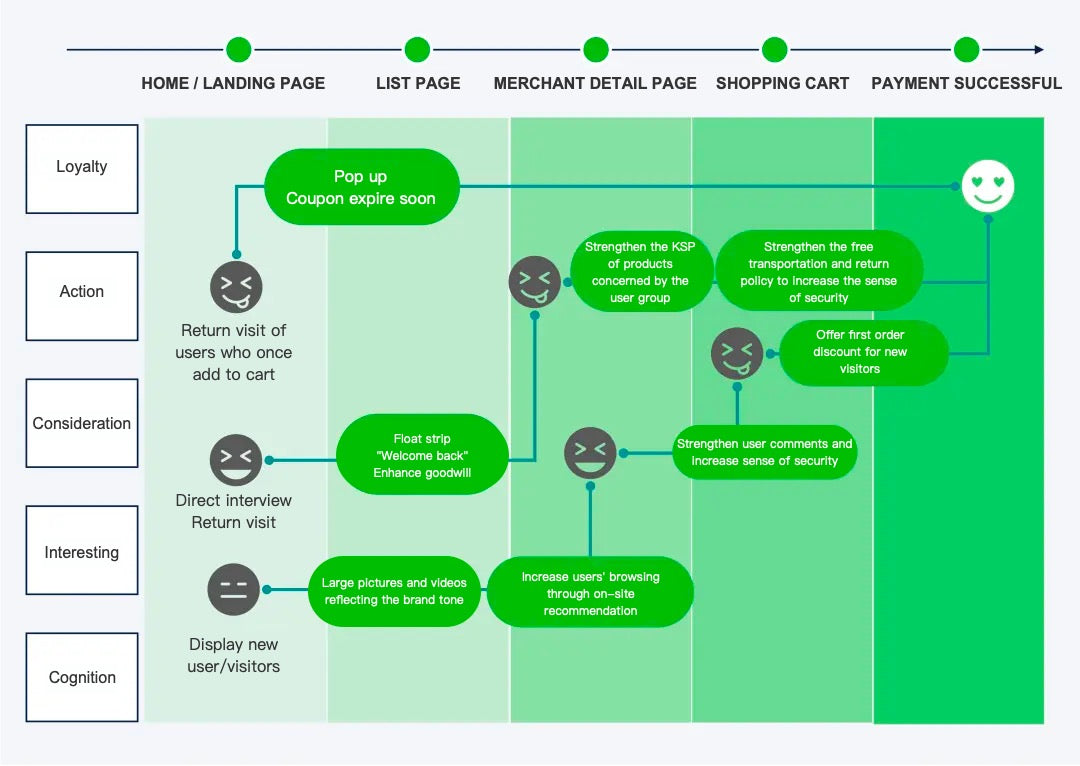
As shown in the diagram above, we can roughly deduce:
- Which pages carry which user journeys;
- Which interface is more suitable for the pop-up window for what purpose;
- Are pop-ups the best means to an end?
Fourth, to draft the content of the pop-up window. Interesting content makes your popups more responsive. Here are a few small suggestions:
- Make it clear and follow the directions of the first, second and third points above;
- What do users get when they pay for information?
- Contains a compelling call to action;
- Highlight the core value of the product;
- Have a little humor.
Fifth, the design should pay attention to:
- In line with the above purpose: use font, capitalization, font size, etc. to highlight key information such as discounts, events, etc.;
- The basic color and style should be unified with the brand tone as much as possible;
- Display core products flexibly as needed.
Sixth, test.
You can do a lot of A/B testing, speak with data, and end all arguments!
- Are the various link settings accurate and effective?
- There are nuances to language and design, which is better?
- Do you want to come up with a bold innovation (think carefully)?
Seventh, think about whether the purpose of the pop-up window in the second item above is the ultimate purpose?
What other actions are needed later? If you look at the operation of the entire D2C website from the perspective of CVR and LTV, the operation runs through the entire shopping life cycle of users.
Of course, we hope that the more users buy, the better, so the operation is endless.
- After collecting mailboxes, consider email writing according to user type;
- Let users click to subscribe;
- What interface will you use to respond after you send an email and get a loyal user to visit again?
- To do new popups? - let's go back to point 2.
2. Typical cases of pop-up windows
Enough said about the method, here are 8 interesting pop-up windows for you, I hope to give you some inspiration~ Let's take a look:
1. Co-Schedule's retention popup
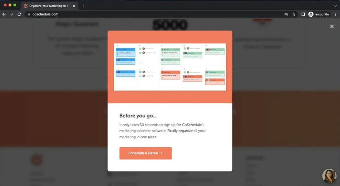
It starts with "Registration only takes 30 seconds", which means that the registration process is simple.
In this way, some users who find it troublesome may change their minds. Co-Schedule's main business is marketing calendar software, providing solutions to users.
The message ends with "It's finally time to put all your marketing in one place." Because we understand that the audience is marketers, Co-Schedule implies through information that choosing this product is very beneficial for marketing.
In this way, the information is more pertinent. Displaying a preview image of a product in a popup is useful for promoting a product.
Users can see in advance what they will get before purchasing and subscribing to the service. A button showing "Schedule a Demo" redirects to a demo appointment and offers an opportunity to try the product.
2. Frank Body's click-to-subscribe pop-up
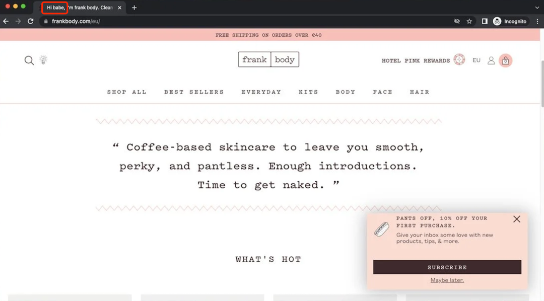
Frank Body is a skincare brand that focuses on acne problems.
Their pop-up window shows how to make everything consistent with the brand style: the website label starts with "Hi babe", the tone is sincere, and there is a little ambiguity.
The title of the pop-up is "Take off your pants". Humorously draws users' attention to 10% off their first purchase. "Give your inbox a little love" is a clever copy.
The language style is in line with the brand's tonality and achieves the purpose of asking for authorization: subscribe to learn about new products and product usage tips. Brands can communicate effectively with customers. In addition, the style of the pop-up window is similar to the overall design of the website, and it looks very homey.
3. LEGO selection popup
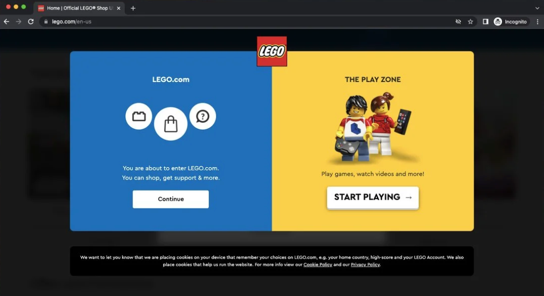
This popup from LEGO provides information about different parts of the website, which is useful to users.
It outlines what people can see on a website. For LEGO, such an option would also be useful.
"Continue" redirects the user to the online store.
"Start Playing" redirects the user to the LEGO homepage and play area - a simple categorization of the visiting user from the very beginning.
This means that the LEGO website can offer more targeted things based on this. The style of the popup is simple and straightforward, but it fits the brand.
The LEGO logo and base colors are used in this popup. Also, LEGO characters are displayed in the play area section to make it look more interesting.
4. MeUndies registration popup
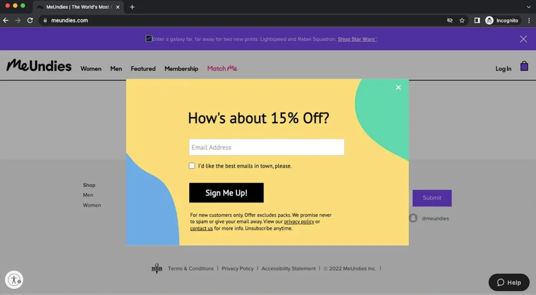
MeUndies is an underwear company.
They use a simple and clear popup in this interface: "How about a 15% discount?" The way to get the discount is to sign up with an email address.
Meanwhile, MeUndies has the next step in mind - "I want the best email in town, please". It's a call-to-action that shows the quality of your brand's emails.
After the user checks it, the brand is also authorized to send emails to the user.
5. Old Navy registration popup
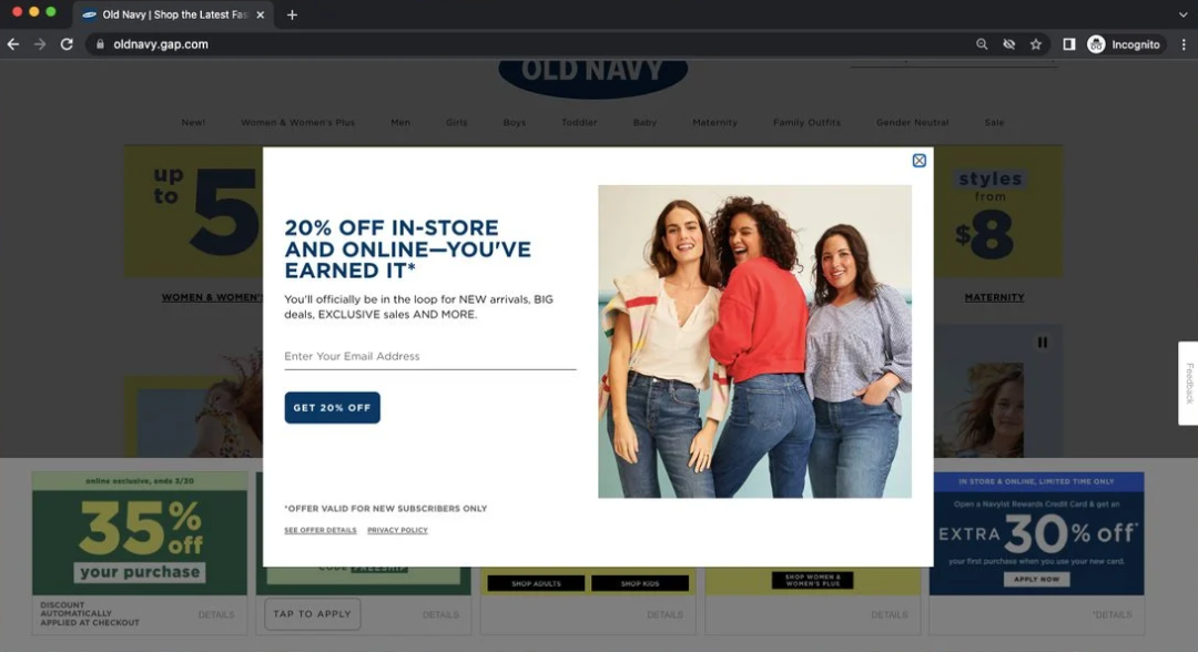
Old Navy’s pop-up is headlined with a 20% discount and ends with positive words like “This is what you earned.”
The description section of the popup continues to use positive adjectives and phrases. These powerful words create a positive image in people's minds.
"NEW arrivals, BIG deals, EXCLUSIVE sales." Use capitalized adjectives to boost impact and increase user engagement.
6. Pitviper's retro-style popup
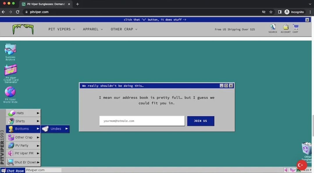
The retro-inspired website of the sunglasses company Pitviper shows an old-fashioned window—it blends in with the site’s homepage and doesn’t even look like a pop-up.
In addition to paying great attention to brand recognition, this popup uses humorous language. The title is "We Really Shouldn't be doing this";
In the copy section, they added: "The address book is pretty full, but I guess we could fit you in."
The copy hints at a lot of subscribers—maybe not that many, but someone with the same sense of humour as the brand wouldn’t mind leaving a contact?
7. Pool Factory's email registration popup
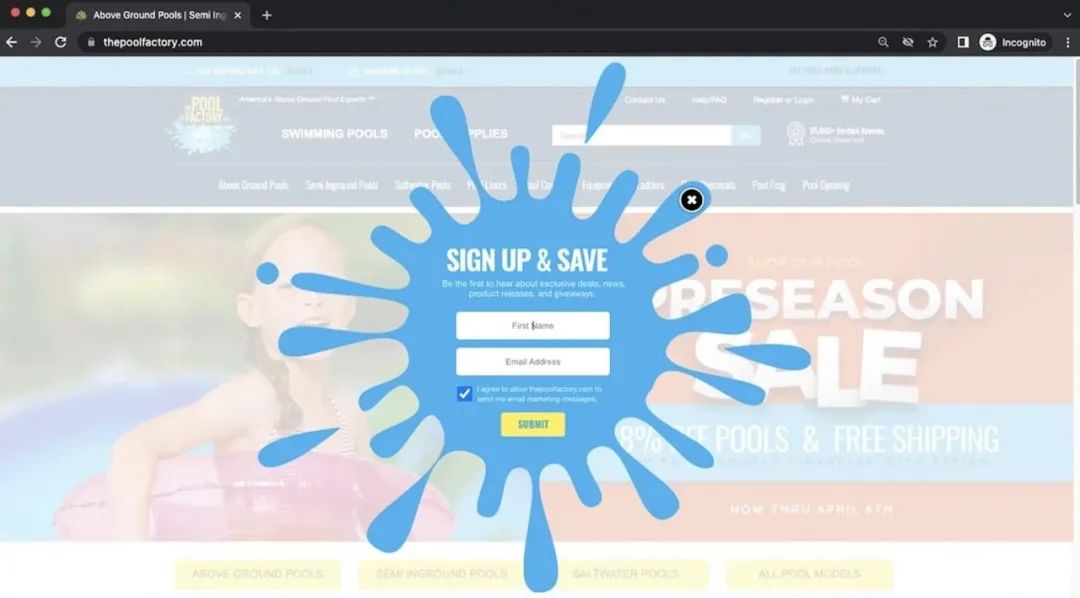
The Pool Factory is a company that sells swimming pool related products.
Their pop-up design has a splash-like effect that draws attention well. The title simply says, "Sign up and save," as crisp as a drop of water to the ground, without adding other creative ideas.
Because the design is already unique and has a strong brand recognition.
8. Revolve email registration popup
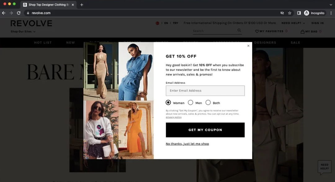

The email pop-up for designer clothing brand Revolve also begins with a discount offer.
The text uses the greeting of "Hey, good lookin!" to represent the user's recognition and friendly attitude.
Users can choose to receive new products or discounts for men, women, or both.
This not only allows users to appreciate the brand’s intentions, but also feels that they are being well cared for.
And brand-side mass emails are more precise—at least not gender-wise.
3. Write at the end
Try more and worry less. For example, the pop-up window "Everyone complains" is otherwise a treasure. If you use it well, you can really make all user happy.
Related Article
HOW TO GUIDE FOR LAUNCHING A WEBSITE
Launching a great website in a short period of time requires organization and management. Here’s an overview of the information and resources you and your website designer will need in order to complete your website.
If you like the article, please share it with others with page link, thanks for your supporting! ❤


Leave a comment