

Axure Tutorial: Make Dropdown with Interactive Checkboxes
Introduction
Dropdowns are often used in UI/UX design. In this tutorial, we will learn how to make a dropdown with checkboxes.
These checkboxes will have check all/uncheck all interactive effect.
Widgets Setup
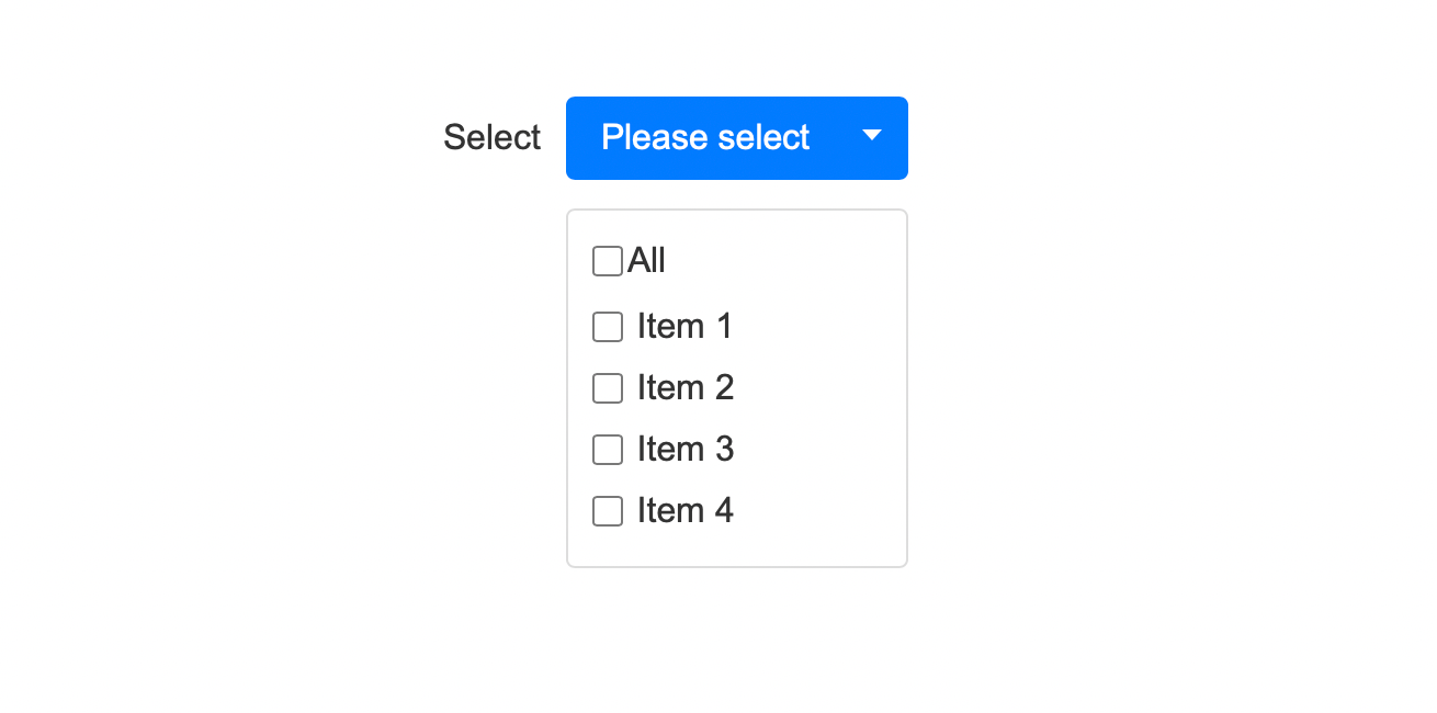
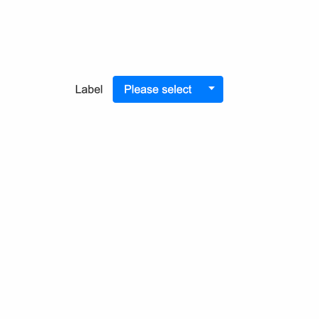
1. You need to make a label (select), a dropdown button(with arrow), and a list of checkboxes(item X). Among them, checkboxes need to be grouped and named Dropdown list.
Interactions Setup
Dropdown Button Interaction
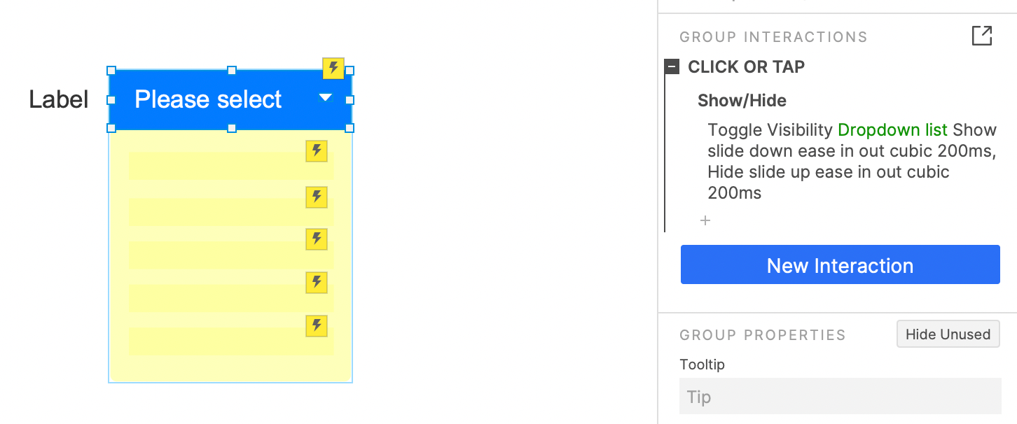
When the button is clicked, the dropdown list panel visibility will be toggled.
Checkbox lists Interactions
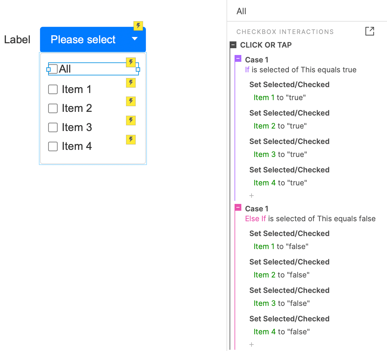
In order to achieve the interactive effect of the All button.
When the All button is clicked, if the button is not selected, all checkboxes will be selected; if the button is selected, all checkboxes will be unselected.
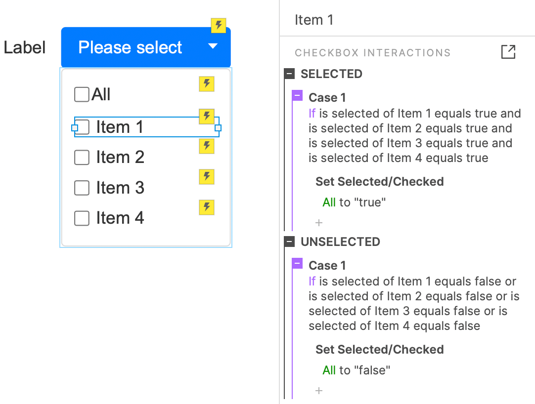
For items, we need to judge the selection state of other items when they are selected or unselect, to realize the selected/unselected interaction of All Item.
For an item, if all items are selected, select All Item; If an item is not selected, All Item is unselected.
Copy its interaction into other 3 items.
In this way, all the settings are completed. If you have any questions and suggestions, please leave a message.
If you like the article, please share it with others with page link, thanks for your supporting! ❤
Note: Click here to download the completed RP file for this tutorial (RP 10 or up).
Well Joe @AxureBoutique, a technology writer and teacher, focuses on Axure prototype design and product design.


Leave a comment